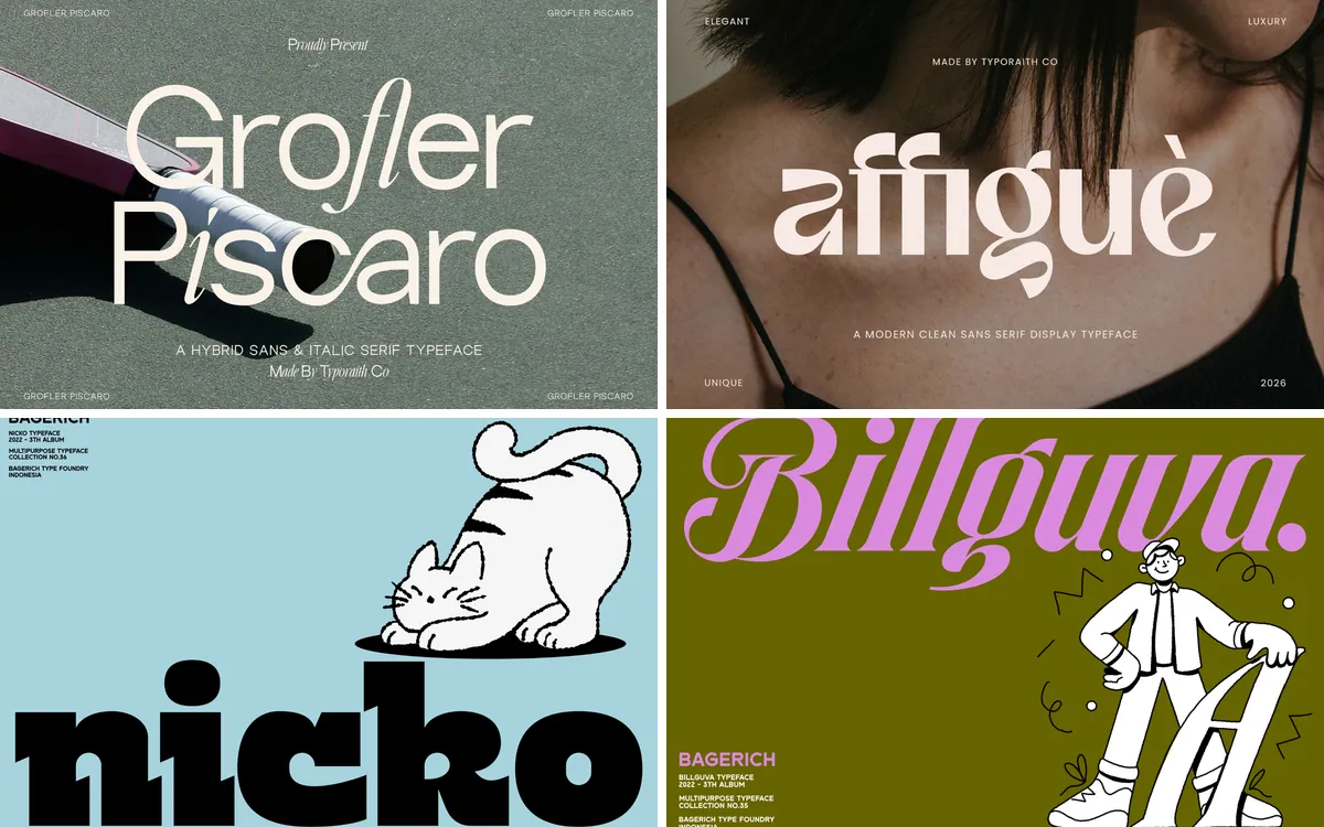
Canva has quietly become the place where a lot of everyday design happens: Instagram posts, café menus, wedding invitations, the price list taped to a market stall. In almost all of it the fonts carry the design, and the way two fonts sit together decides whether a post looks considered or thrown together.
This guide is about font duos: fonts that come as a matching pair of styles, usually a script with a sans or a serif with its italic. It brings together duos from different studios for cafés, fashion, beauty and parties.
The short version
- La Planca de Cafetaria Font Duo: cafés, bakeries and lifestyle brands
- Being Another Font Duo: bold social posts and posters
- La Cabane Font Duo: vintage cafés, bakeries and merch
- Folkies Vantage Font Duo: rustic labels and t-shirt prints
- Great Respect Font Duo: fashion, editorial and quote posts
- Richmond Grovelyn Font Duo: beauty, perfume and luxury branding
- Nineties Party Club Font Duo: party invites, events and retro brands
- Honey Sweetheart Font Duo: romantic, sweet and kids' designs
In this guide
- Sans and script duos
- 1. La Planca de Cafetaria Font Duo
- 2. Being Another Font Duo
- 3. La Cabane Font Duo
- 4. Folkies Vantage Font Duo
- Serif duos
- 5. Great Respect Font Duo
- 6. Richmond Grovelyn Font Duo
- Playful and retro duos
- 7. Nineties Party Club Font Duo
- 8. Honey Sweetheart Font Duo
- The rules behind these combinations
- By the numbers
- FAQ
- Sources
Sans and script duos
1. La Planca de Cafetaria Font Duo
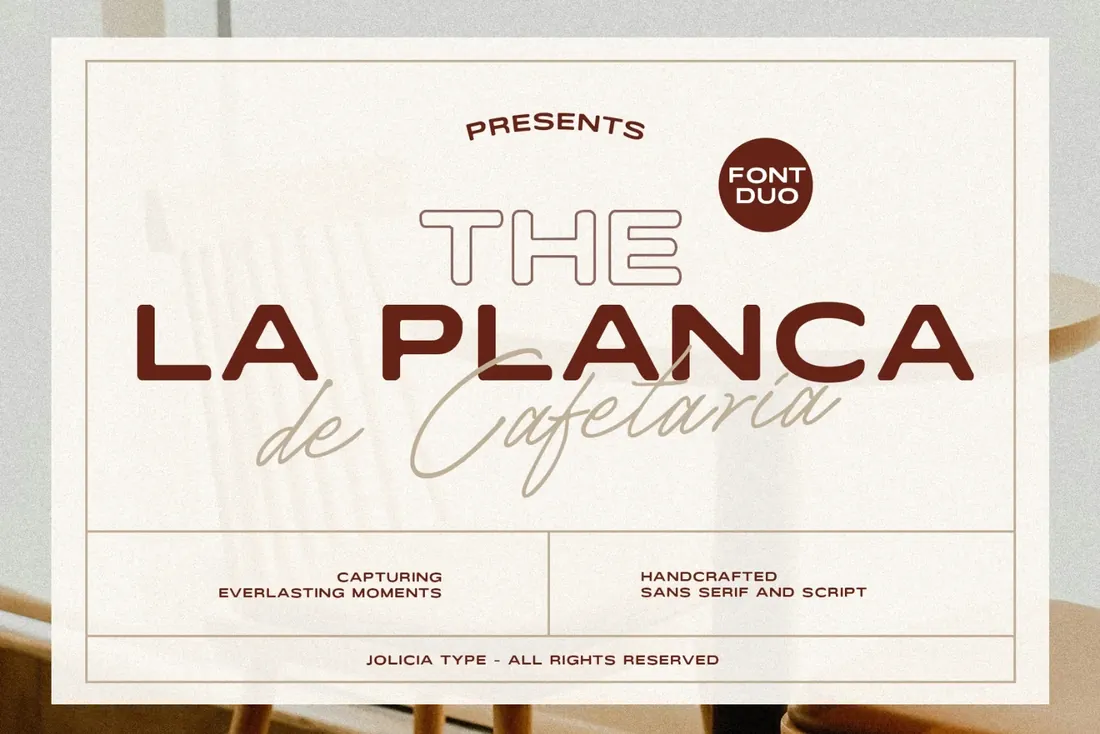
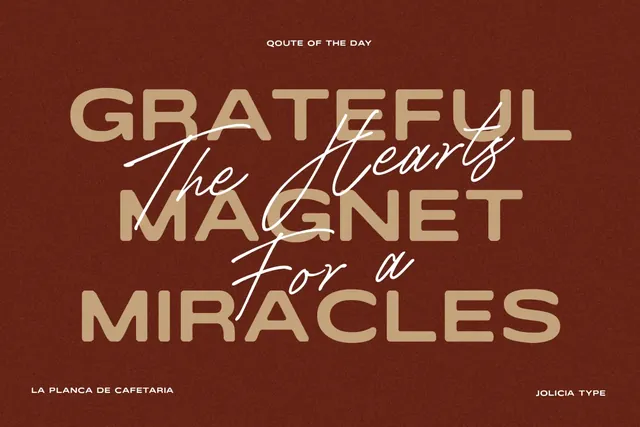
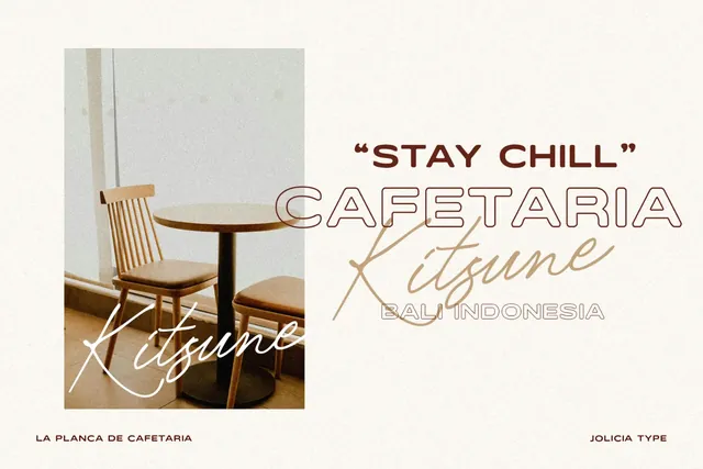
La Planca de Cafetaria pairs an elegant, slightly wide sans serif with a light handwritten script. The sans holds the name of the place or the product, the script adds a personal line underneath, and together they read like the sign of a small café that cares about its menu boards. In Canva it suits menus, price lists, opening-hours posts and packaging labels.
- Best for: cafés, bakeries and lifestyle brands.
- Pair it with: The two styles cover most designs; add Montserrat (free in Canva) for small print.
- Tip: Set the script a little smaller than the sans and let it overlap the line above. Duos like this are drawn to be layered.
Where to download


2. Being Another Font Duo
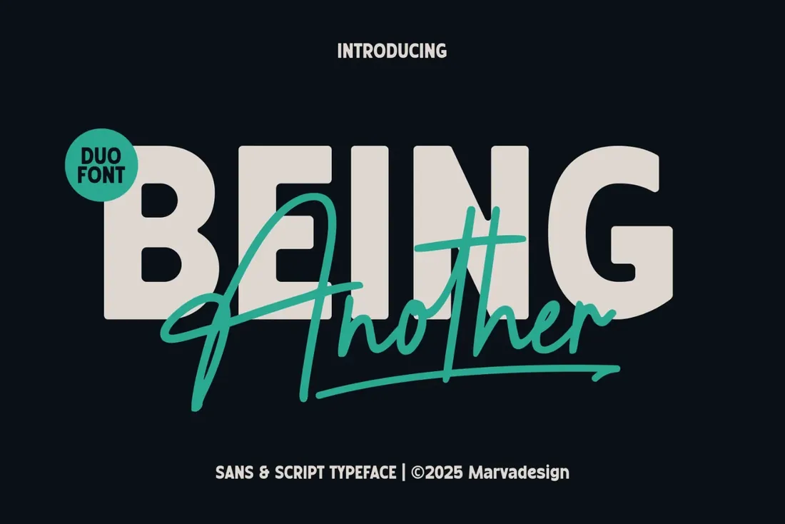
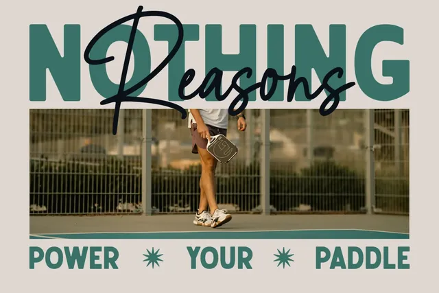
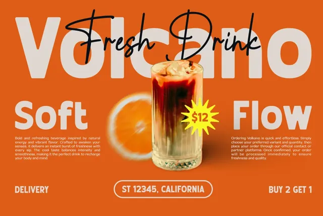
Being Another combines a heavy, rounded sans serif with a fast, energetic handwritten script. The sans is built for headlines that have to be read mid-scroll; the script is meant for one accent word across it. It's the duo for sale announcements, event posters, YouTube thumbnails and quote graphics that need punch.
- Best for: bold social posts and posters.
- Pair it with: Poppins or Open Sans (free in Canva) for body text.
- Tip: Put the script over the sans in a contrasting color: the layered look this duo is drawn for.
Where to download
3. La Cabane Font Duo
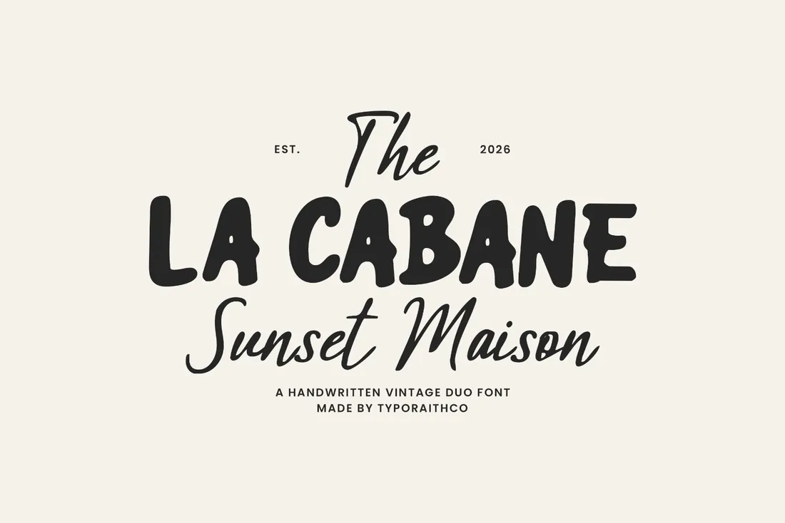
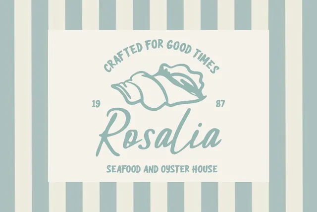
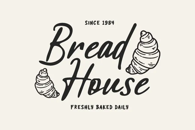
La Cabane is a handcrafted vintage duo: bold retro display lettering with a relaxed handwritten script. It has the warmth of a hand-painted shop sign, which suits bakery packaging, coffee shop identities, restaurant menus and retro t-shirts. The designer includes multilingual support and OTF, TTF and WOFF files, so both styles upload to Canva as they are.
- Best for: vintage cafés, bakeries and merch.
- Pair it with: Lora (free in Canva) for menu descriptions.
- Tip: Use the display style in capitals for the name and the script in lowercase for the tagline.
Where to download
4. Folkies Vantage Font Duo
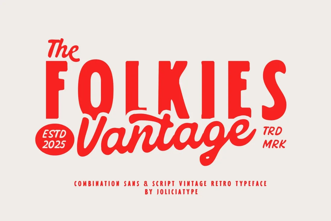
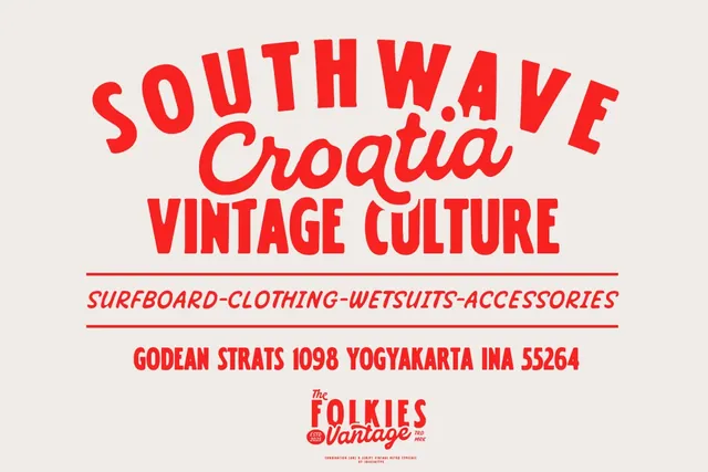
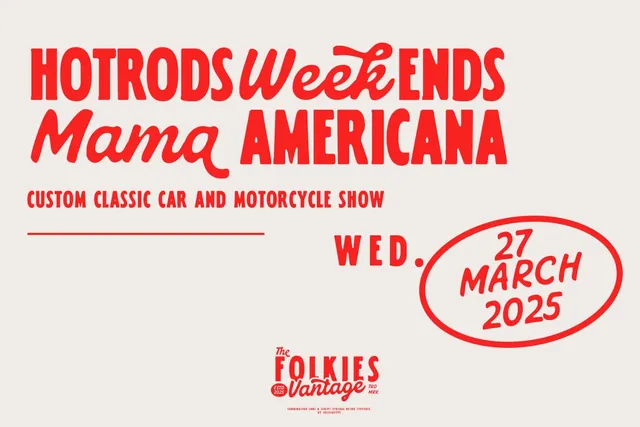
Folkies Vantage is a vintage duo with a rough edge: a strong sans serif and a script with worn, inky strokes, like an old printed label. The texture is part of the letterforms, so even a flat Canva design looks printed. It works for craft beer and coffee labels, merch, rustic branding and posters.
- Best for: rustic labels and t-shirt prints.
- Pair it with: Open Sans (free in Canva) for small text, where texture gets lost.
- Tip: The worn texture shows best at large sizes. Keep small details in a clean font.
Where to download
Serif duos
5. Great Respect Font Duo
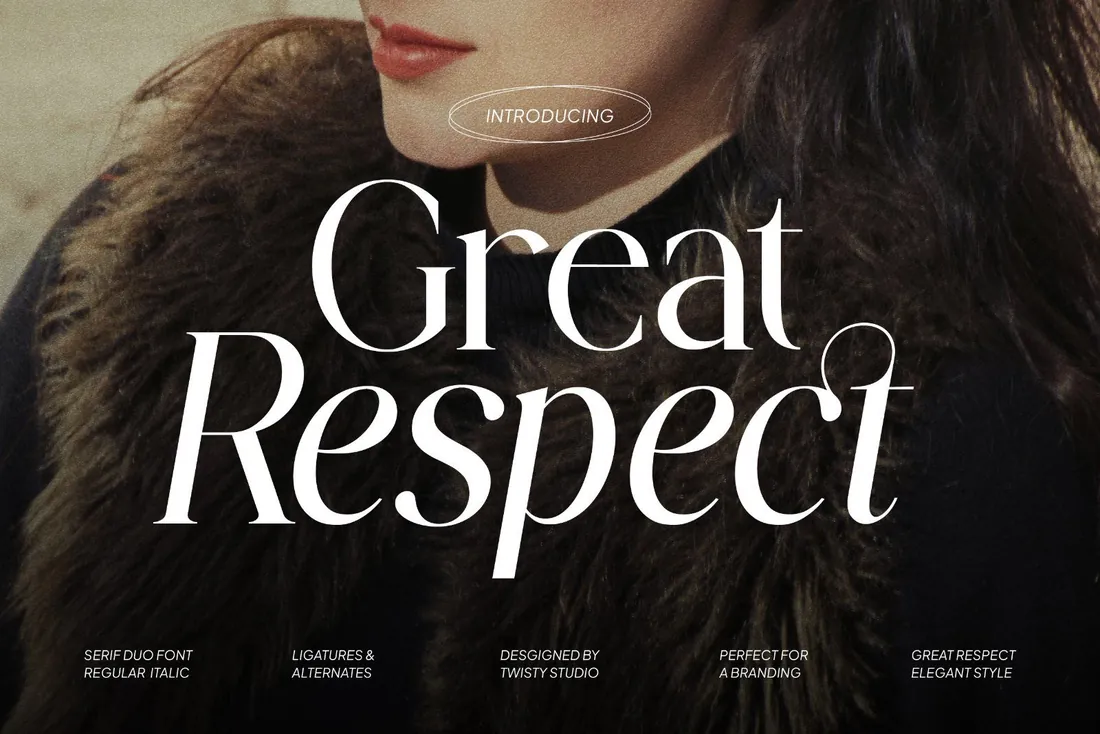
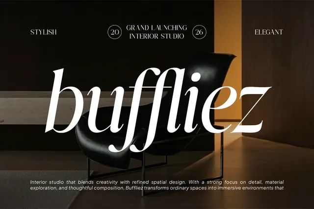
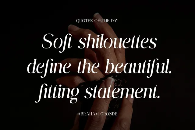
Great Respect is a serif duo: an upright serif and a matching italic with graceful swashes, designed as one family. That's the classic editorial pairing, regular for the headline and italic for the word you want to stress, the look of magazine covers and fashion campaigns. The designer lists multilingual support, alternates and ligatures.
- Best for: fashion, editorial and quote posts.
- Pair it with: Montserrat (free in Canva) for body text.
- Tip: Switch to the italic for a single word in the middle of a headline. The contrast does the design.
Where to download
6. Richmond Grovelyn Font Duo
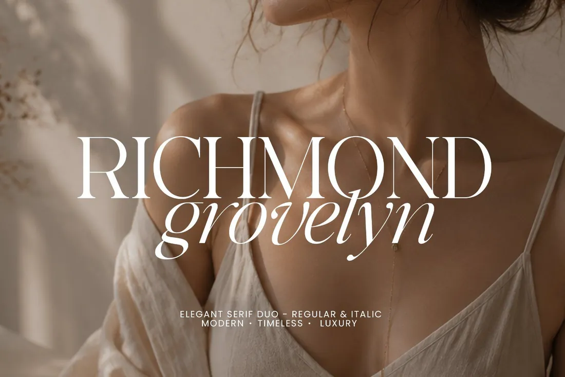
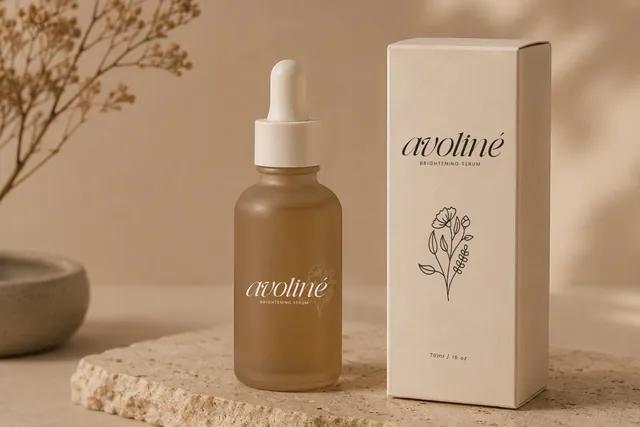
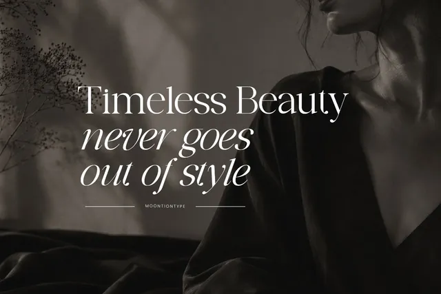
Richmond Grovelyn pairs a high-contrast serif with an elegant italic companion and stylish ligatures. It's made for the quiet, expensive look of skincare packaging, perfume branding and boutique Instagram feeds, where a brand name in the serif and a tagline in the italic is all the decoration a design needs.
- Best for: beauty, perfume and luxury branding.
- Pair it with: Raleway Light (free in Canva) for product details.
- Tip: Give the serif capitals generous letter spacing. High-contrast serifs look most luxurious with room around them.
Where to download
Playful and retro duos
7. Nineties Party Club Font Duo
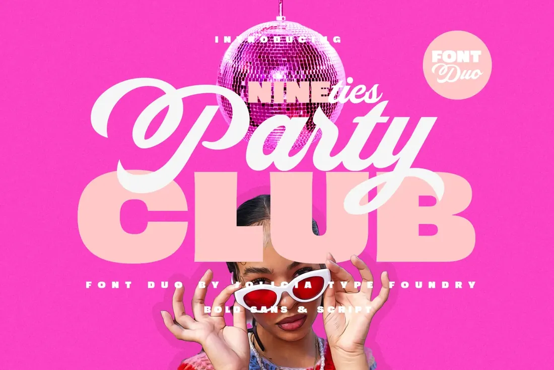
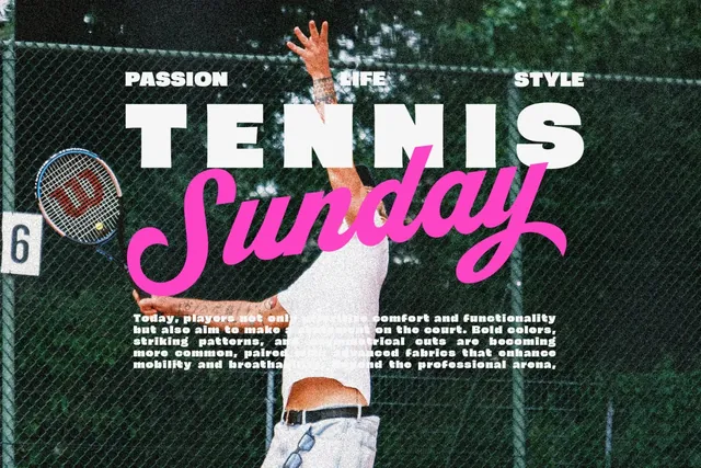
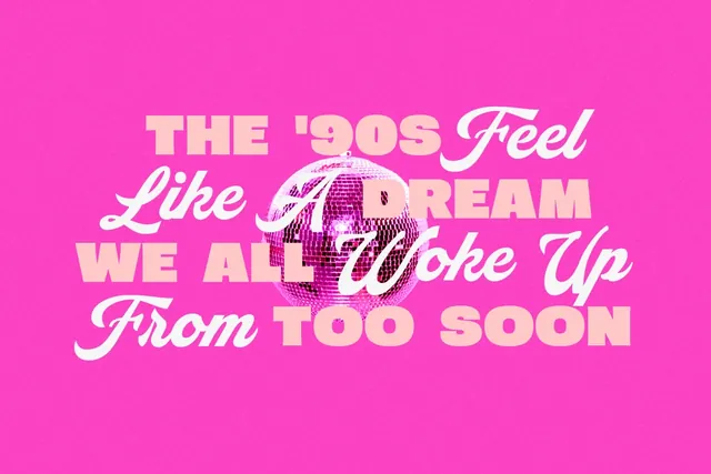
Nineties Party Club brings back the 90s with a solid sans serif and a thick, bouncy script. Both styles are heavy, so they hold their own on bright backgrounds and photos, which is exactly where party posters, birthday invitations and promo stories live.
- Best for: party invites, events and retro brands.
- Pair it with: Poppins (free in Canva) for the date and place.
- Tip: Stack the sans in two lines and run the script diagonally across them.
Where to download

8. Honey Sweetheart Font Duo
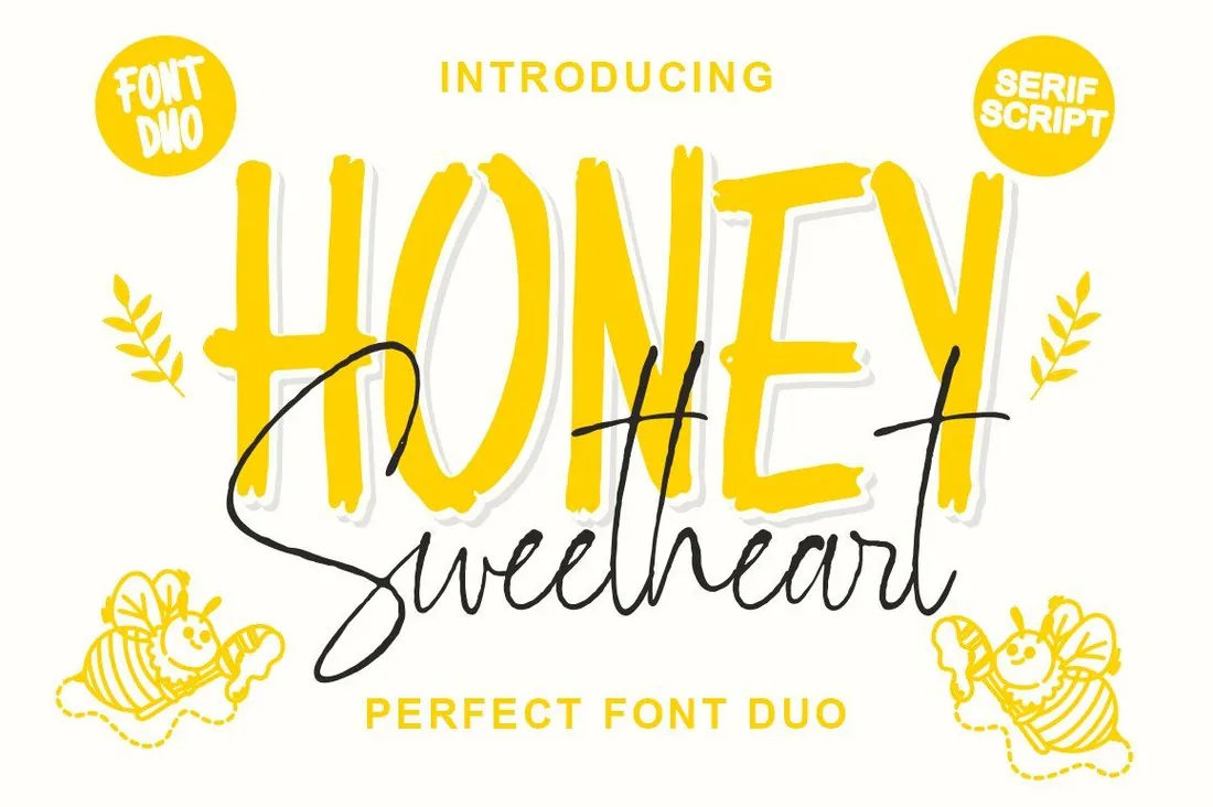
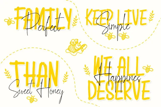
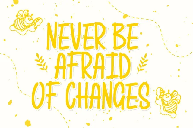
Honey Sweetheart combines a soft, chunky serif with a light script, a pairing that feels warm and a little romantic. It suits greeting cards, Valentine's and baby shower invitations, dessert packaging and kids' party posts. The extra glyphs are PUA-encoded, so alternates can be copied in from a character map even in apps without a glyph panel.
- Best for: romantic, sweet and kids' designs.
- Pair it with: Montserrat (free in Canva) for the details.
- Tip: Use the script for a name or one sweet word and let the serif carry the rest.
Where to download
The rules behind these combinations
- Give each font one job. The headline font sets the mood; the body font does the reading. Canva's own pairing guide recommends distinct styles with a clear role for each.
- Contrast in more than one way: style (serif and sans), weight (heavy and light) or width (condensed and wide). Two fonts that differ only slightly look like a mistake.
- Keep scripts to short headings. Long passages in a script are hard to read, on screen and in print.
- Two fonts are enough. For a third level of hierarchy, use another weight of the body font instead of a third typeface.
- Upload both styles of a duo to your Brand Kit and save them as text styles, so every new design starts with the pairing in place. The Canva fonts guide walks through the upload.
By the numbers
- 265M+monthly active Canva users, with more than 31 million paying users, as of early 2026TechCrunch, Feb 2026
- 3 formatsCanva accepts for font upload: OTF, TTF and WOFFCanva Help: Upload and use Brand Kit fonts
- 5 planslet you upload your own fonts to Canva: Pro, Teams, Business, Education and NonprofitsCanva Help: Upload and use Brand Kit fonts
Frequently asked questions
What are the best font combinations in Canva?
A font duo is the easiest way to get a combination that works, because both styles are designed together. Great Respect suits editorial and fashion posts; La Planca de Cafetaria suits cafés and small lifestyle brands.
What is a font duo?
A font sold as a matching pair of styles, usually a sans or serif with a script or italic. Both styles are designed together, so they share proportions and details and pair without guesswork.
How many fonts should I use in one Canva design?
Two: one for headlines and one for everything else. If you need a third level, use a heavier or lighter weight of the body font instead of adding a new typeface.
Can I upload fonts on Canva's free plan?
No. Uploading fonts needs Canva Pro, Teams, Business, Education or Nonprofits. Once uploaded, a font stays in your Brand Kit for all your designs.
Can I sell Canva templates that use these fonts?
Check the font license first. Selling templates to other people usually needs a broader license than using a font in your own designs. Our font license guide explains the tiers in plain English.
What are the best Canva font pairings?
Pairings with clear contrast: a script with a sans serif, a heavy sans with a light serif, or a serif with its own italic. The font duos in this guide are drawn as pairs, so they work straight away; for more font pairing ideas, combine a duo with a free Canva font such as Montserrat or Poppins for small text.
Final thoughts
Choose the duo that matches the mood of the project, upload both styles, and keep a free Canva font for long text. Saved as text styles in your Brand Kit, the pairing is ready in every new design.
Sources
- TechCrunch, Feb 2026
- Canva Help: Upload and use Brand Kit fonts
- Canva Design School: Font pairing basics
Last checked October 31, 2026.
This guide contains affiliate links. If you buy through them, mockupex may earn a commission at no extra cost to you. Learn more