Luxury is often decided in the first second. Before anyone reads the words on a perfume box, a hotel sign or a jewelry tag, the letters have already told them what kind of brand this is.
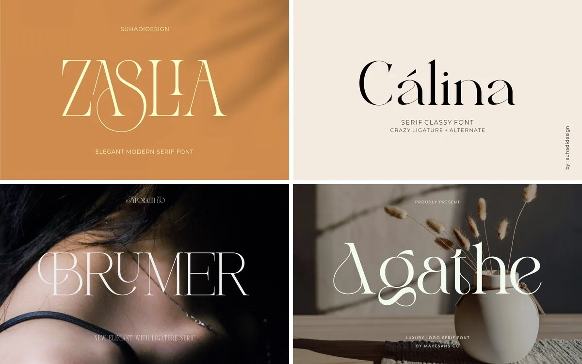
This guide brings together luxury fonts for branding in very different moods: high-contrast and editorial serifs, refined sans serifs with crafted details, a serif and script duo, ligature wordmarks and one bold statement font.
The short version
- Mergola Font: boutique, jewelry and skincare brands that want a modern look with a crafted feel
- Luneve Font: perfume, jewelry and cosmetics labels built on quiet, elegant capitals
- Milky Font: fashion labels, salons and skincare products that want an editorial wordmark
- Old String Font: heritage-style brands, jewelers and wedding stationery that need a serif and a script in one
- Monas Font: beauty salons, photo studios and restaurants that want a fashion-magazine look
- Calora Font: cosmetics, lifestyle and home decor brands with a softer, playful kind of elegance
- Luxena Font: architecture, real estate and consulting brands that want a tall, confident wordmark
- Qorsa Font: luxury streetwear, vintage boutiques and bold fashion campaigns
- Asoga Font: fragrance, fashion and high-end brands that want a custom-looking wordmark
- Resquel Font: fashion magazines, lookbooks and beauty campaigns
In this guide
1. Mergola Font
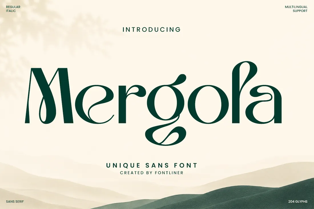
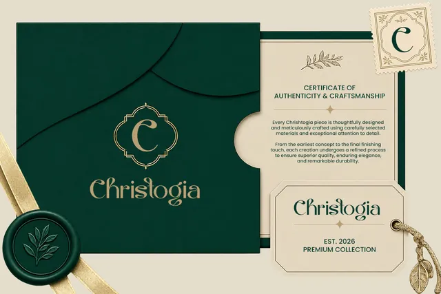
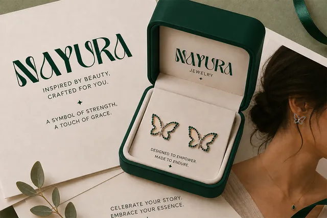
Most luxury brands choose between a serif that looks traditional and a sans that looks plain. Mergola sits in between: a sans serif with curved, calligraphic details, so a boutique, a skincare line or a jewelry brand can look modern and still feel made by hand. The designer's samples put it on certificates, jewelry boxes and tote bags, where a short name does all the branding.
- Best for: boutique, jewelry and skincare brands that want a modern look with a crafted feel.
- Pair it with: Old String's quill script for a signature line or a product name.
- Tip: Use the alternates in the logo and keep body text in a plain sans; the curves are made to be seen large.
Where to download

2. Luneve Font
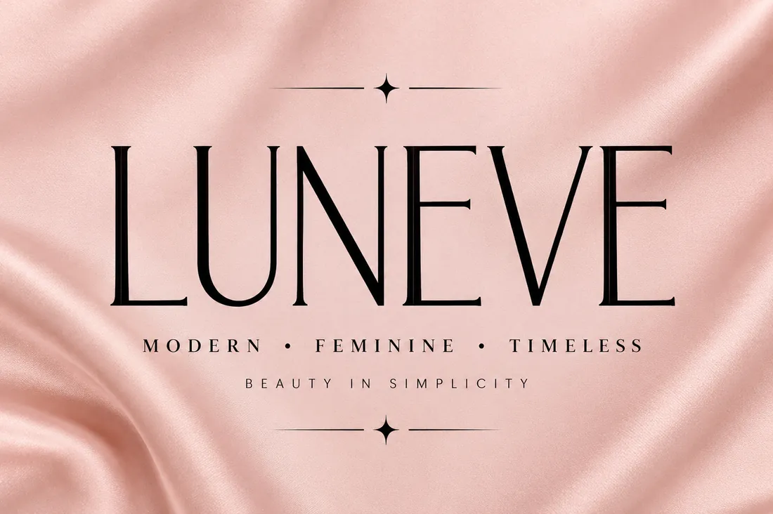
Luneve is the restrained option: thin, high-contrast letters with plenty of air, the look of a perfume or jewelry label that says little and costs a lot. It's sold as an OTF file only, so, as the designer notes, check that your design software supports OTF before you buy.
- Best for: perfume, jewelry and cosmetics labels built on quiet, elegant capitals.
- Pair it with: Mergola for a warmer headline, or a plain sans for small print.
- Tip: Set it in capitals with wide letter spacing; delicate strokes need size and space to read as luxury.
Where to download
3. Milky Font
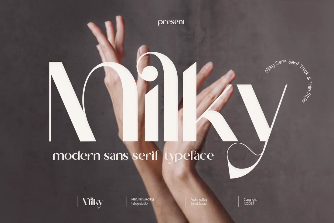
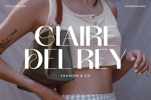
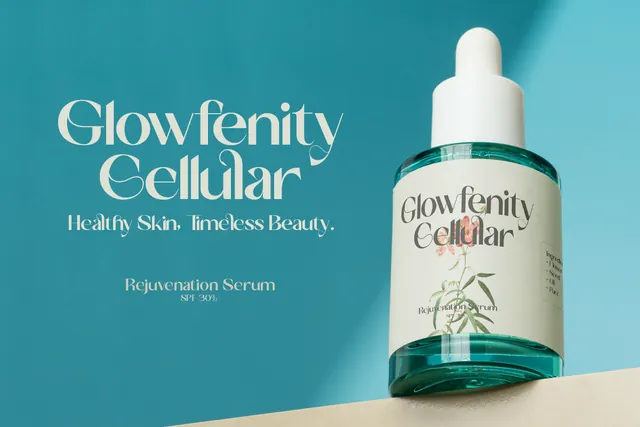
Every letter mixes a thick and a hairline stroke, so even an ordinary word looks like a custom fashion logo. That makes Milky a fast way to give a clothing label, a hair salon or a skincare serum an editorial look. The designer recommends Illustrator, Photoshop or InDesign to reach all the alternate glyphs.
- Best for: fashion labels, salons and skincare products that want an editorial wordmark.
- Pair it with: Luxena for tall, quiet subheadings.
- Tip: Keep it to one or two words; the strong contrast gets busy in long lines.
Where to download
4. Old String Font
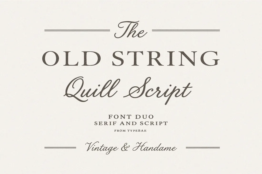
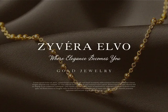
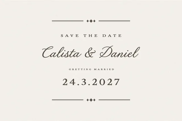
A serif and a script designed to work together solve the pairing problem for heritage brands: the serif carries the name, the quill script adds a signature or a tagline. It suits jewelers, wineries, tailors and wedding stationery, anywhere a brand wants to look established rather than new.
- Best for: heritage-style brands, jewelers and wedding stationery that need a serif and a script in one.
- Pair it with: None needed: the duo already includes both styles.
- Tip: Keep the script for short phrases like a name or a date; quill scripts tire the eye in long text.
Where to download
5. Monas Font
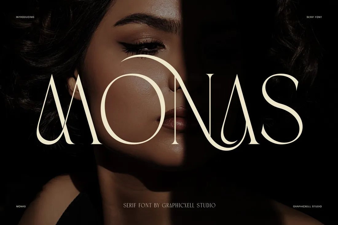
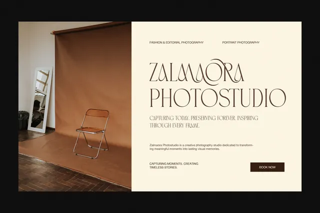
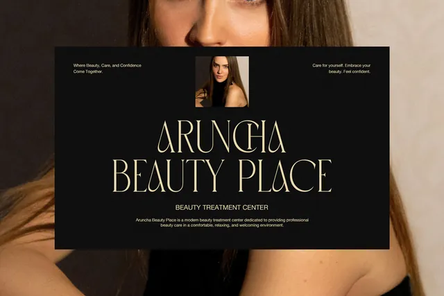
Extreme contrast between hairlines and heavy vertical strokes is the classic look of fashion magazine covers. Monas brings it to service businesses as well: the designer's samples show a beauty salon, a photo studio and a restaurant, where a headline in Monas signals a premium experience before anyone reads the prices.
- Best for: beauty salons, photo studios and restaurants that want a fashion-magazine look.
- Pair it with: Mergola for menus, price lists and website text.
- Tip: Hairlines vanish at small sizes and on textured paper, so keep Monas for headlines.
Where to download
6. Calora Font
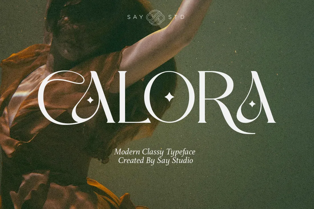
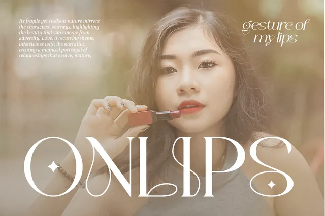
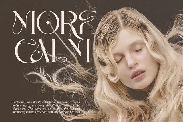
Luxury doesn't have to be strict. Calora's playful curves give a cosmetics brand, a women's magazine or a home decor shop a softer, more personal kind of elegance, a good fit for brands that talk to their customers on Instagram rather than in a boardroom.
- Best for: cosmetics, lifestyle and home decor brands with a softer, playful kind of elegance.
- Pair it with: Luxena for a calmer second headline.
- Tip: Give the curvy letters room; tight letter spacing makes them collide.
Where to download
7. Luxena Font
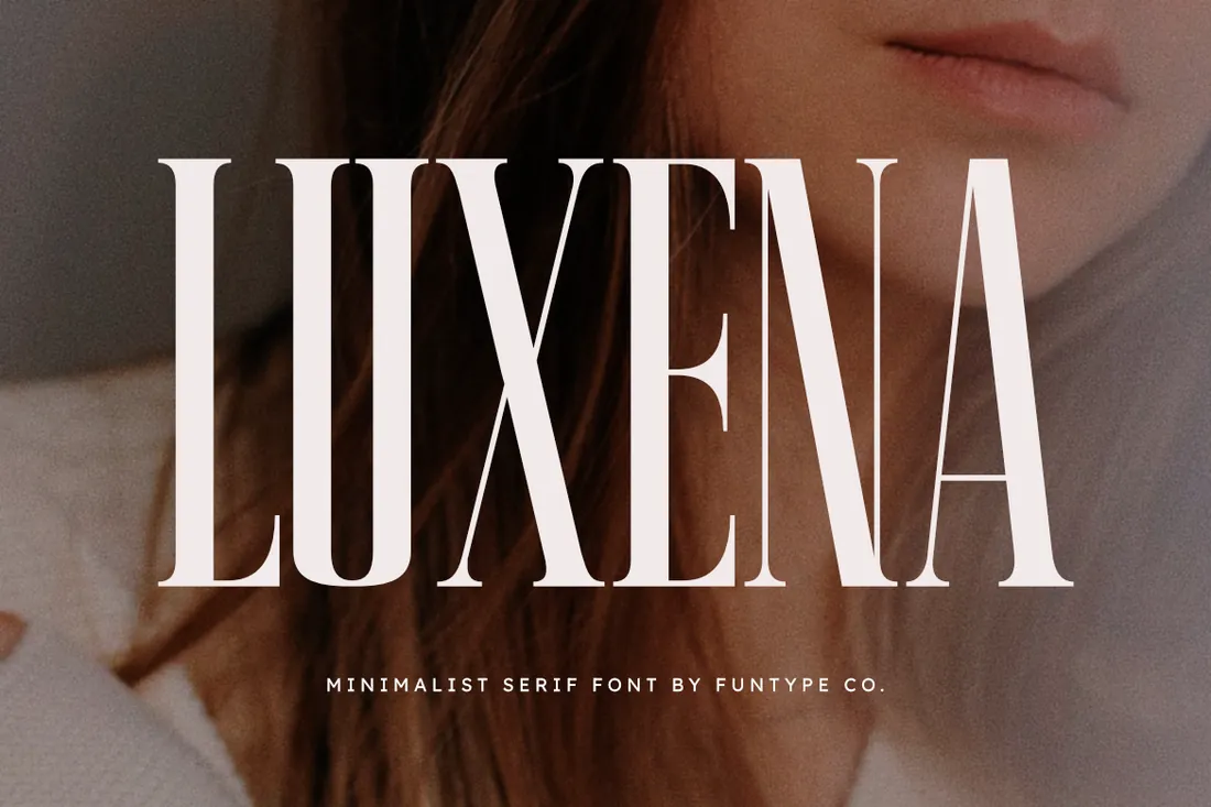
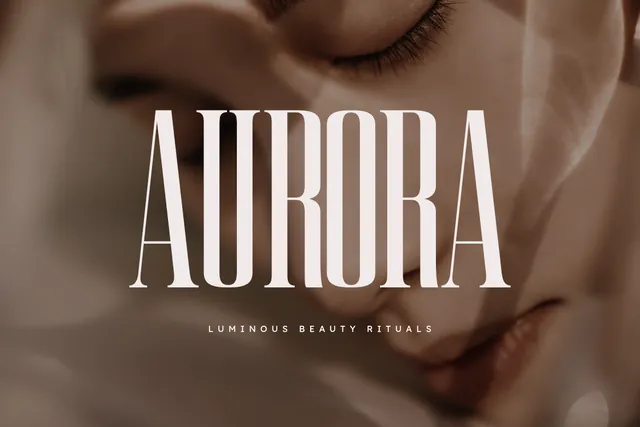
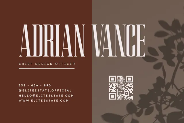
Tall, narrow letters fit a long name on a business card, a building sign or a phone screen without shrinking. That's why Luxena suits architects, property developers and consultants who want to look premium and confident, as the designer's business card and interior samples show. OTF and TTF files are included.
- Best for: architecture, real estate and consulting brands that want a tall, confident wordmark.
- Pair it with: Mergola for body text and contact details.
- Tip: Narrow letters need generous line spacing in multi-line headlines, or the lines start to merge.
Where to download
8. Qorsa Font
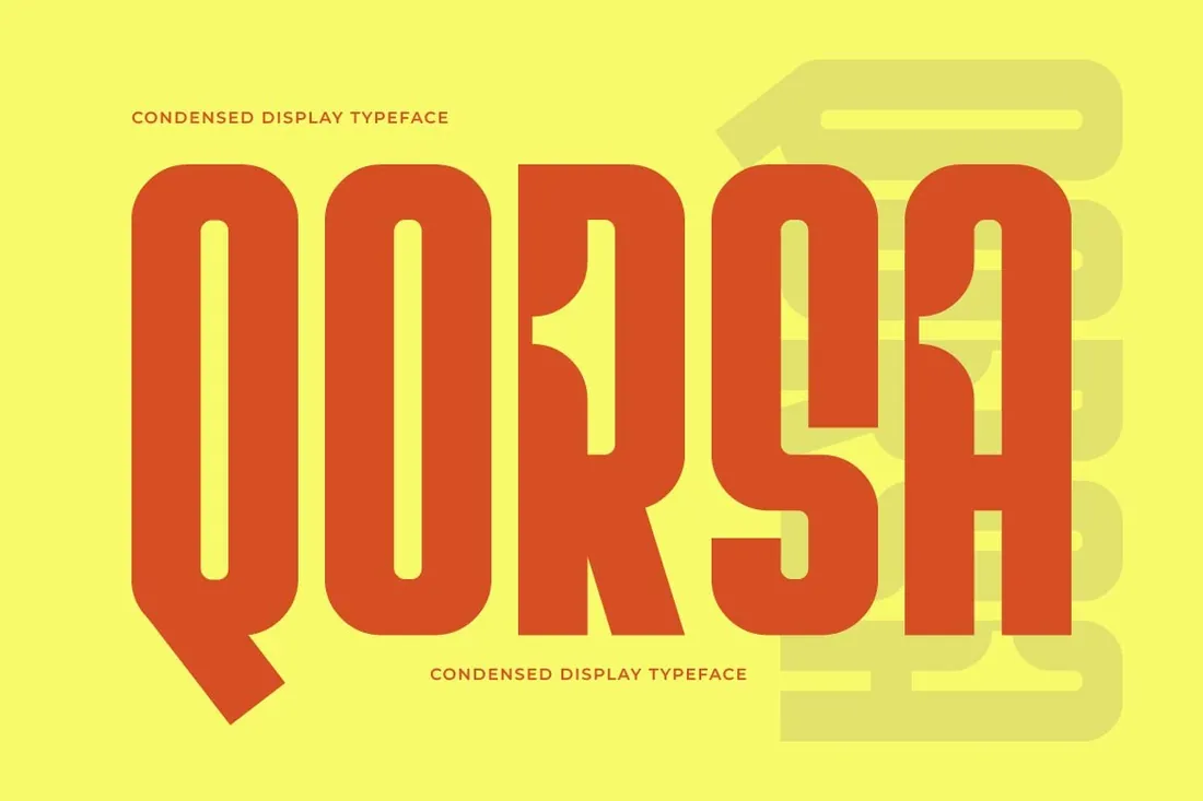
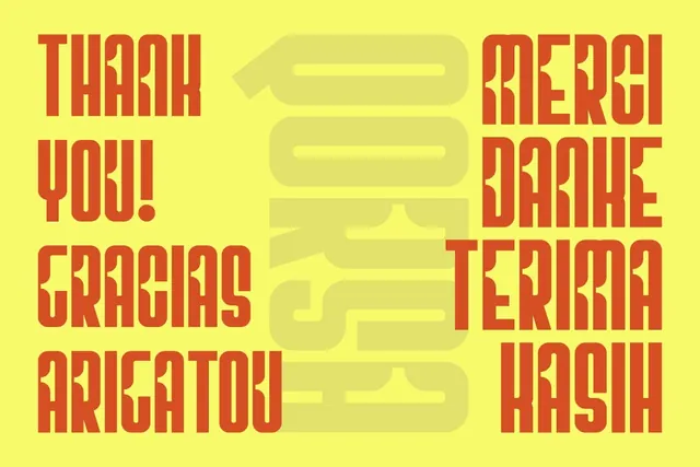
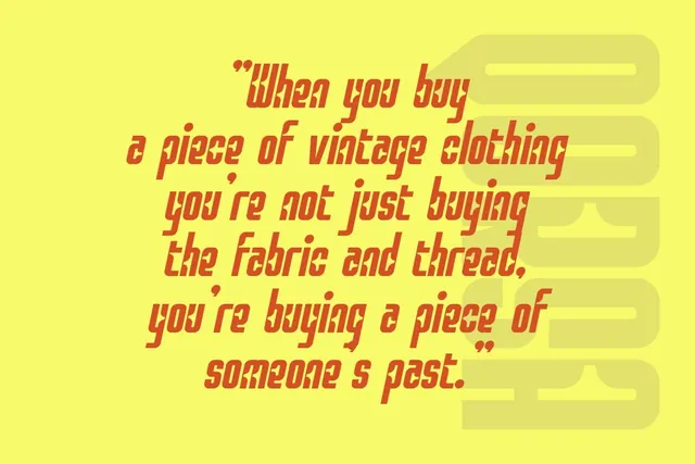
Qorsa is the loud one in this list, and that's the point: luxury streetwear, vintage boutiques and fashion drops often pair a quiet logo with one massive headline. Its dense, tall letters fill a poster or a shopping bag edge to edge, and details like the long tail of the Q and the notched R keep it from looking generic.
- Best for: luxury streetwear, vintage boutiques and bold fashion campaigns.
- Pair it with: Luneve in small, spaced capitals for contrast.
- Tip: Use it for very short words; ultra-heavy condensed type loses readability in sentences.
Where to download
9. Asoga Font
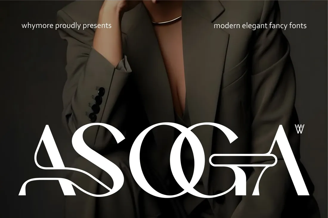
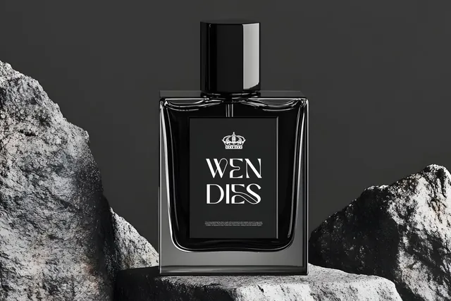
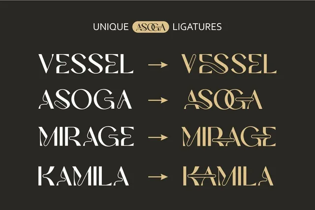
Asoga's ligatures change how whole words look: pairs of letters merge into a single shape, as the designer's samples show, so a perfume or fashion name becomes a logo without drawing anything. It's a shortcut to the custom wordmark look of high-end fragrance brands.
- Best for: fragrance, fashion and high-end brands that want a custom-looking wordmark.
- Pair it with: Mergola for product descriptions.
- Tip: Try every ligature on the real brand name before choosing; some letter pairs look better joined than others.
Where to download
10. Resquel Font
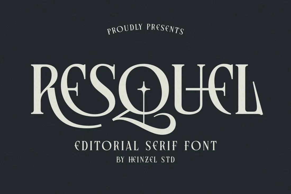
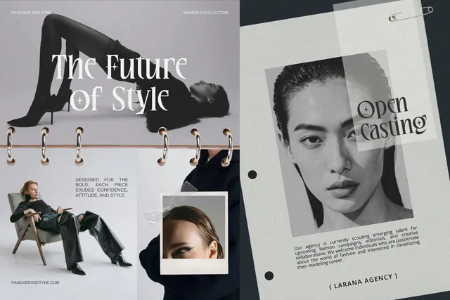
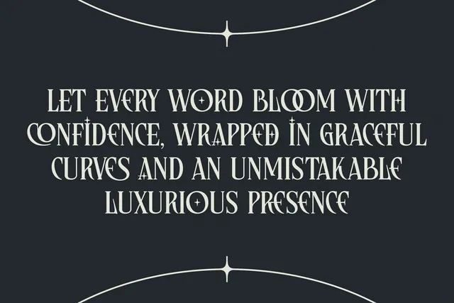
Resquel is made for editorial work: magazine covers, lookbooks and campaign headlines where dramatic letter details carry the whole page. A fashion or beauty brand that publishes its own lookbooks or newsletters can use it to look like a magazine rather than an online shop.
- Best for: fashion magazines, lookbooks and beauty campaigns.
- Pair it with: Mergola for body text in lookbooks and newsletters.
- Tip: Pair one large headline with plenty of white space; editorial serifs look best with room around them.
Where to download


How to make a brand look luxurious with type
- Use fewer fonts. One font for the name and one for text is enough; luxury brands rarely use more.
- Give letters room. Generous spacing and margins read as expensive, while crowded layouts read as a discount.
- Choose a lane: a high-contrast serif for drama, a refined sans for quiet luxury, or a bold display font for a statement campaign.
- Check the logo small. Hairline strokes vanish on a favicon or a tiny label, so keep a simpler version for small sizes.
- Test on real materials. Foil, embossing and textured paper change how thin strokes look, so print a sample before the run.
By the numbers
- 1961is the year poster artist A.M. Cassandre drew the interlocking YSL monogram for the newly founded house, a lettering mark it still usesMusée Yves Saint Laurent Paris: Cassandre
- 5+major fashion houses, including Saint Laurent, Burberry, Berluti, Balenciaga and Celine, replaced decorative logos with simplified sans serif lettering within a few years; designers link the shift to phone screensQuartz: How your phone changed fashion's logos
- 2023the year Burberry returned to a serif wordmark, a sign that serifs are coming back to luxury brandingInside Retail, Feb 2023
Frequently asked questions
What fonts do luxury brands use?
Mostly two styles: high-contrast serifs, the look of fashion magazines and perfume, and clean, widely spaced sans serif capitals, which many fashion houses adopted in the late 2010s. Scripts and ligature wordmarks are common for fragrance and personal brands.
What are good luxury font pairings and combinations?
A high-contrast serif for the name with a refined sans for text, for example Monas with Mergola, or a ready-made serif and script duo like Old String.
Can I use luxury fonts in Canva?
Yes. Canva lets you upload OTF and TTF files on its paid plans. Fonts with many alternates, such as Milky, are easier to use in Illustrator or Photoshop, where the Glyphs panel shows every variant.
Do I need a commercial license for a luxury logo?
Yes. A logo for a business is commercial use, so check the license on the product page before you start. Our font license guide explains the tiers.
Final thoughts
Pick one direction and commit to it: a dramatic serif, a refined sans or a bold statement. Give it room, test it small and on real materials, and the brand will look expensive long before anyone sees a price.
Sources
- Musée Yves Saint Laurent Paris: Cassandre
- Quartz: How your phone changed fashion's logos
- Inside Retail, Feb 2023
Last checked October 31, 2026.
This guide contains affiliate links. If you buy through them, mockupex may earn a commission at no extra cost to you. Learn more