Every brand identity starts with a name set in type. Long before there's a color palette or a website, the wordmark is what people see on the business card, the shop sign and the tiny icon in a browser tab.
This guide collects logo fonts for wordmarks, monograms and brand identities, each with a detail a designer can build a recognizable mark around.
The short version
- Humanor Font: tech and service brands that want personality
- Garten Font: friendly consumer brands
- Glafio Font: bold, contemporary identities
- Ragikon Font: playful summer and lifestyle brands
- Goken Font: compact, strong wordmarks
- Therilo Font: monograms and initials
- The More Crowd Font: premium editorial brands
In this guide
Sans serif logo fonts
1. Humanor Font
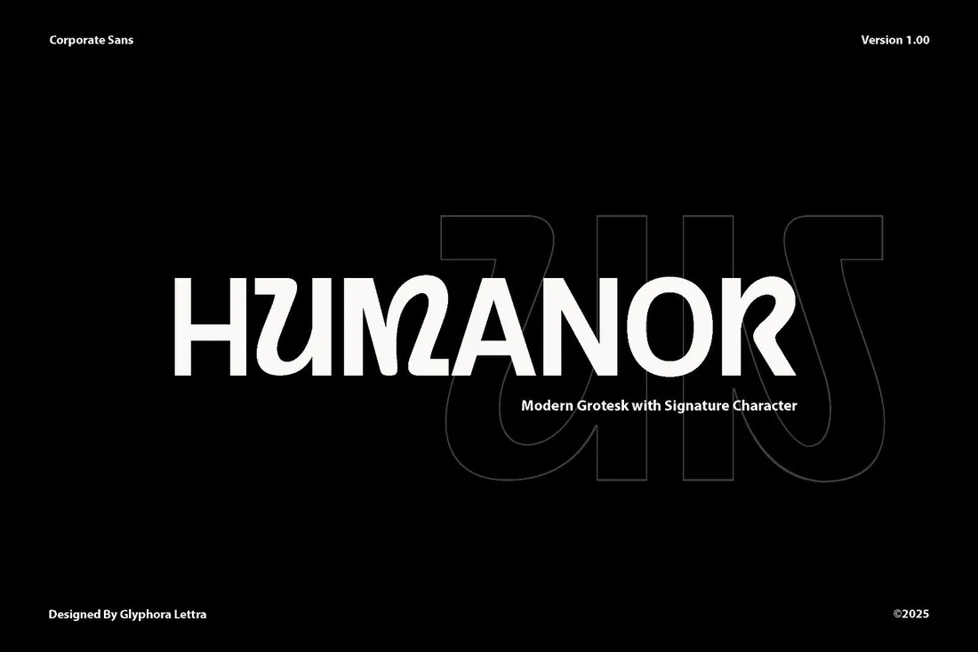
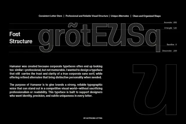
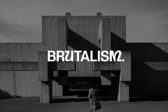
Most logo fonts can't run a website or a presentation. Humanor can: the plain set handles documents and screens, and signature alternates you switch on only for the brand name turn it into a wordmark, so one license covers the logo and the system around it.
- Best for: tech and service brands that want personality.
- Pair it with: Its own regular set for body text; no second font needed.
- Tip: Decide which alternates belong to the logo and write them down, so the brand doesn't drift.
Where to download

2. Garten Font
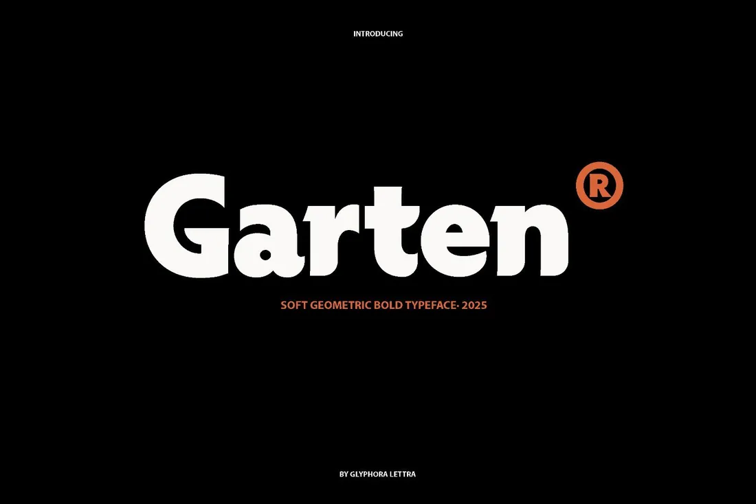
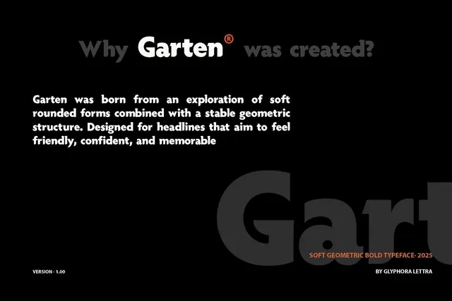
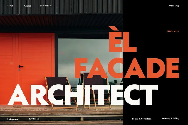
Rounded letters make a brand feel friendly, but many rounded fonts look childish. Garten keeps a clean, geometric structure under the soft shapes, so it works for food brands, apps and kids' products that still need to earn parents' trust.
- Best for: friendly consumer brands.
- Pair it with: A light sans for taglines, to keep the logo the loudest thing on the page.
- Tip: Tighten the letter spacing slightly in the wordmark; bold geometric fonts often look looser than they are.
Where to download

3. Glafio Font
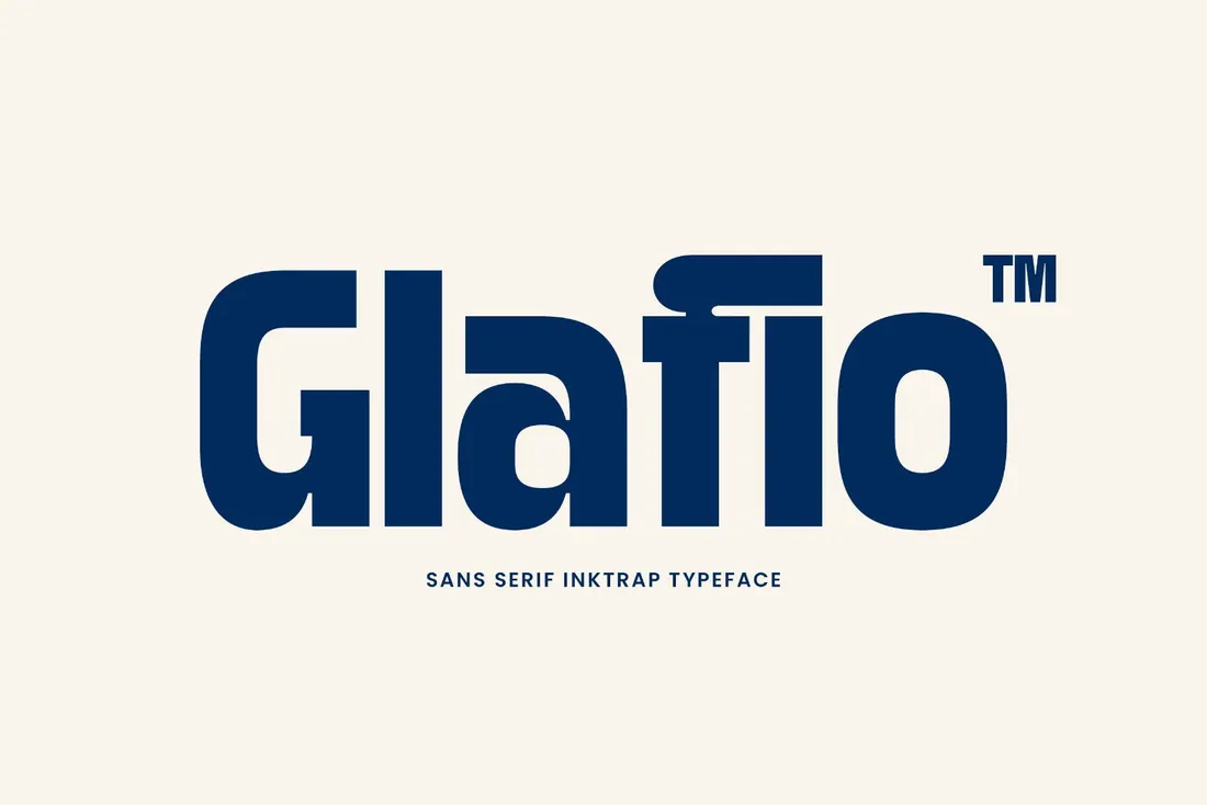
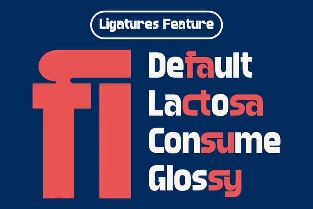
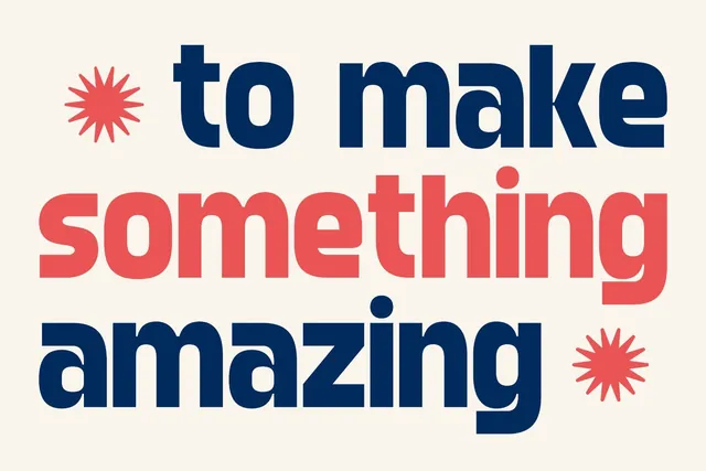
Glafio is a heavy sans with ink traps, the small notches where strokes meet. They keep letters crisp when the logo is small and become a visible style detail when it's large. It suits streetwear, music and event brands that want a contemporary edge.
- Best for: bold, contemporary identities.
- Pair it with: A plain grotesk for supporting text so the ink traps stay special.
- Tip: Check the logo at mid sizes on screen; that's where ink-trap details can disappear.
Where to download
4. Ragikon Font
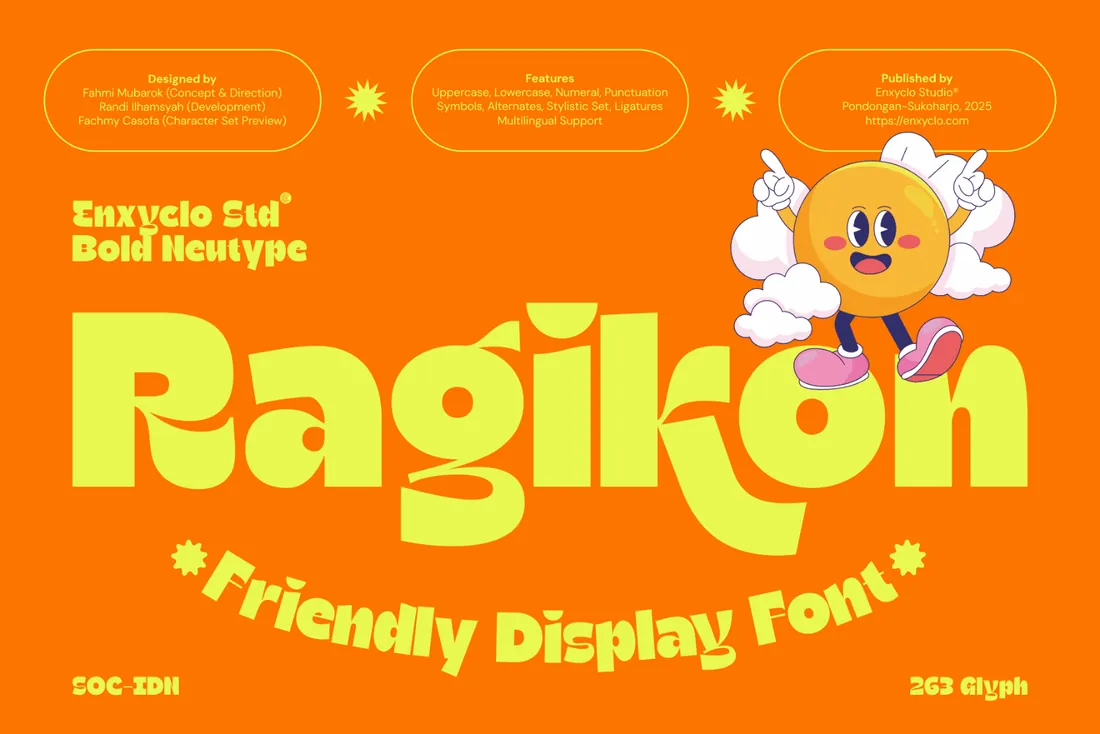
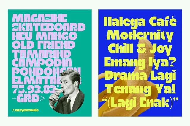
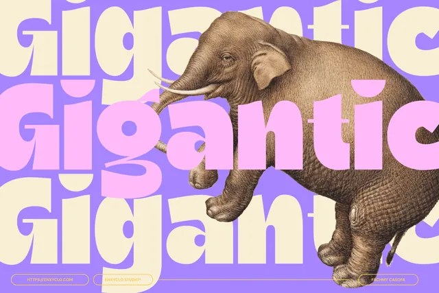
Ragikon has chunky, bouncy letters with a lot of energy. It can carry a brand on its own, which matters for small businesses that won't have a big visual system around the logo. Drinks, snacks, toys and merch are its natural home.
- Best for: playful summer and lifestyle brands.
- Pair it with: A rounded sans for menus and labels.
- Tip: Keep it for the logo and headlines; it's too lively for longer text.
Where to download

5. Goken Font
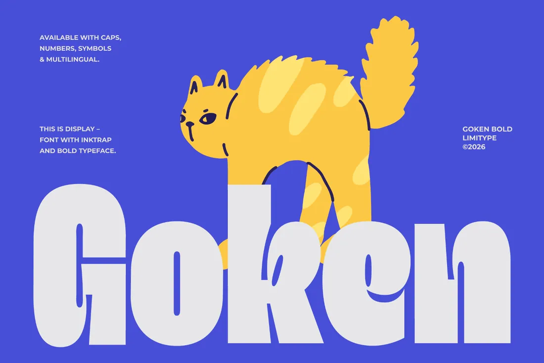
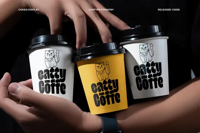
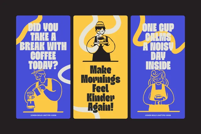
Goken is a compact bold sans with refined ink traps. Short brand names look solid and confident, and it stays legible on signage, product labels and sports kit. If a client asks for a logo that feels strong but not aggressive, start here.
- Best for: compact, strong wordmarks.
- Pair it with: A wider sans for contrast in secondary text.
- Tip: Works best for names of four to eight letters.
Where to download
Monogram and serif logo fonts
6. Therilo Font
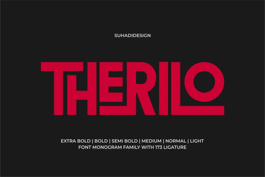
Therilo is a monogram family in several weights, from light to extra bold, with a large set of ligatures for joining letters. It's a shortcut to the interlocking-initials look that usually takes hours of manual kerning, perfect for fashion labels, wedding brands and boutique hotels.
- Best for: monograms and initials.
- Pair it with: A classic serif for the full brand name under the monogram.
- Tip: Try the same initials in two weights: light for print, bold for small digital sizes.
Where to download
7. The More Crowd Font
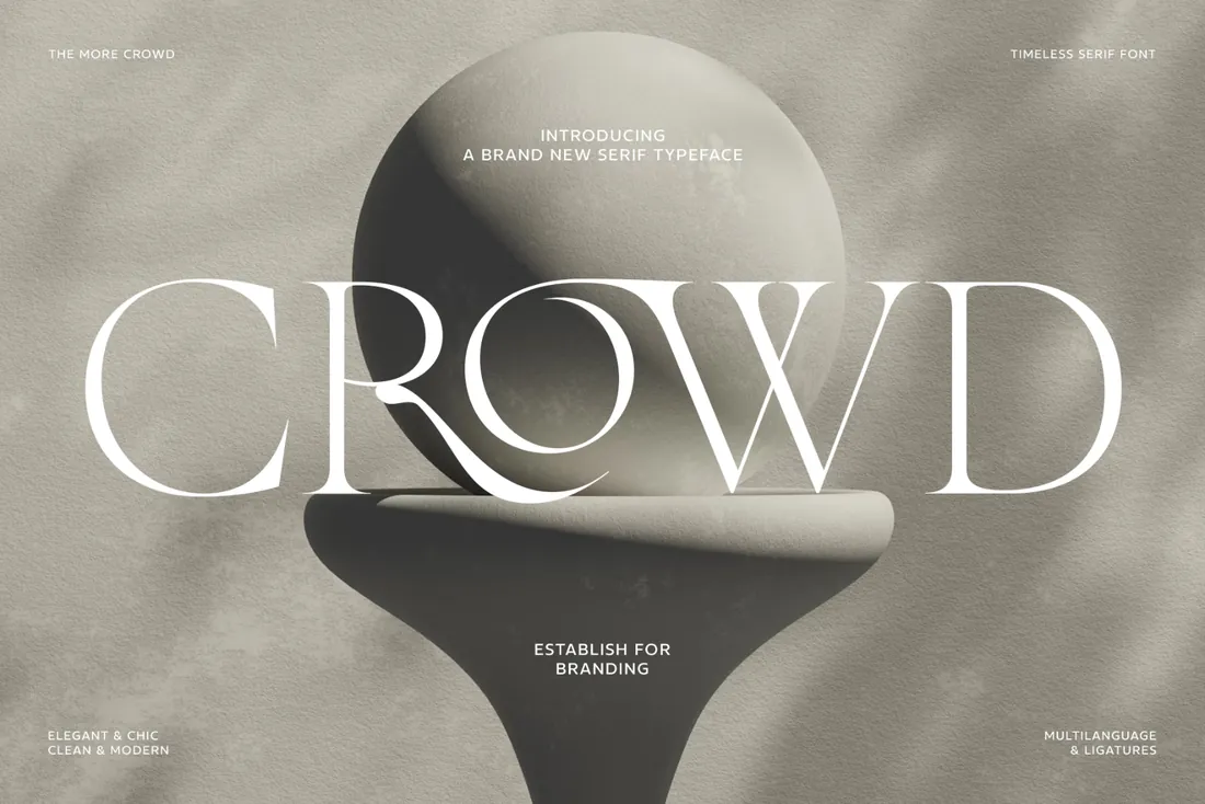
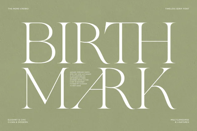
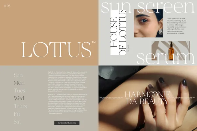
The More Crowd is a high-contrast serif with plenty of ligatures and a classic-meets-modern feel. It shines in wordmarks for studios, publications and hospitality brands that want to look established without looking old.
- Best for: premium editorial brands.
- Pair it with: A light sans for navigation and small print.
- Tip: Fine hairlines don't survive as a favicon; use an initial or symbol at very small sizes.
Where to download
How to test a logo font before you commit
- Set the brand name at 16px and at 400px. Both should feel like the same brand.
- Print it in black on white and in white on black; some fonts change character when reversed.
- Show it on a real surface, like a sign, a label or a business card. A logo mockup reveals spacing problems faster than a blank artboard.
By the numbers
- 5+major fashion houses, including Saint Laurent, Burberry, Balenciaga and Celine, simplified their logos to clean sans serif lettering within a few years, a shift designers link to phone screensQuartz: How your phone changed fashion's logos
- 50 msis roughly how long people take to judge the visual appeal of a web page, according to research from Carleton UniversityNature news on Lindgaard et al., Behaviour & Information Technology, 2006
- 33%is the revenue lift companies attribute to consistent brand presentation, according to a survey of 200+ organizationsLucidpress brand consistency study, Dec 2019
Frequently asked questions
What makes a good logo font?
Clear shapes at small sizes, one distinctive detail you can own, and enough weight to survive on signs and screens.
Should a logo use a serif or a sans serif?
Neither is better. Sans serifs feel modern and direct, serifs feel established and editorial. Choose based on the brand's personality, then test both.
Can I use a font for a client's logo?
Yes, with a license that covers commercial use. Our font license guide explains what to look for.
Do I need to customize the font for a logo?
Not always. Using the font's alternates or ligatures is often enough to make the wordmark feel bespoke.
What are good logo font ideas for a small business?
Match the font to what the business sells: a friendly rounded font like Garten for food and kids' brands, a heavy font with ink traps like Glafio for streetwear and music, a monogram family like Therilo for fashion and weddings, and a classic serif like The More Crowd for studios and hospitality.
Can I use logo fonts in Canva?
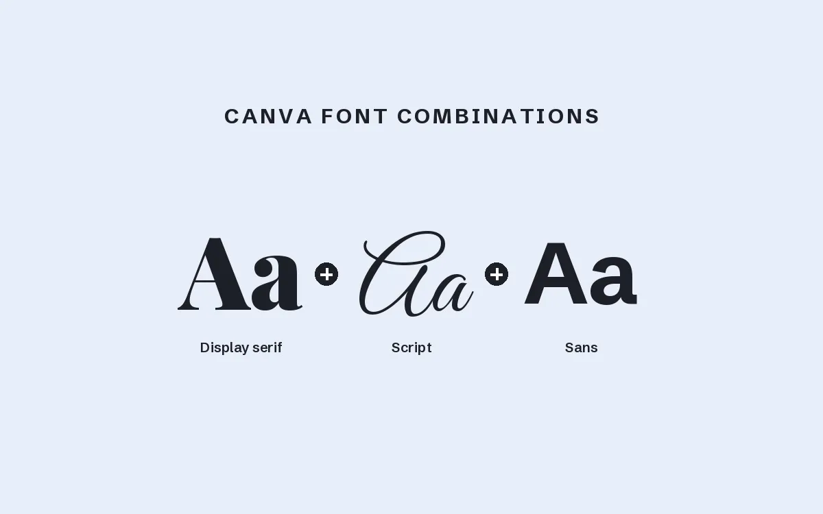
Yes. Canva lets you upload OTF and TTF files on its paid plans, so you can design a logo there. Check that the font's license allows logo use for a business before you publish it.
Final thoughts
Shortlist three fonts, set the real brand name in each, and put them on a mockup before you show the client. The right one is usually obvious once it's on a sign or a box.
Sources
- Quartz: How your phone changed fashion's logos
- Nature news on Lindgaard et al., Behaviour & Information Technology, 2006
- Lucidpress brand consistency study, Dec 2019
Last checked October 31, 2026.
This guide contains affiliate links. If you buy through them, mockupex may earn a commission at no extra cost to you. Learn more