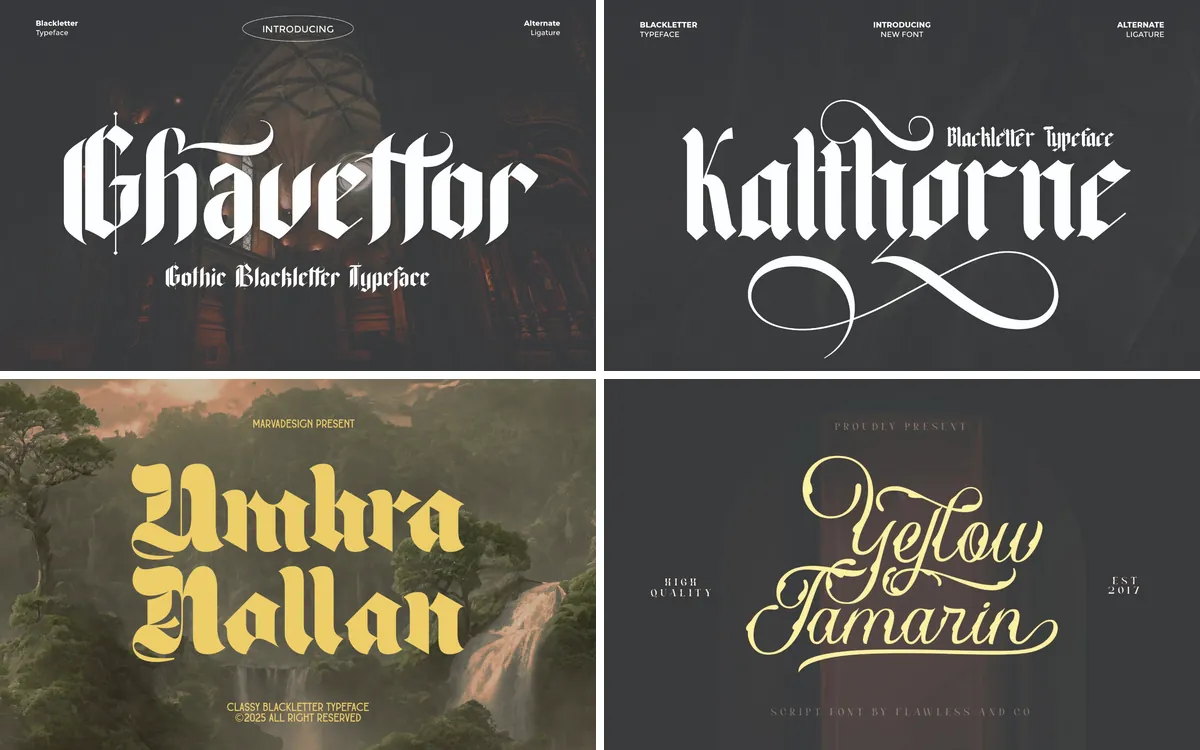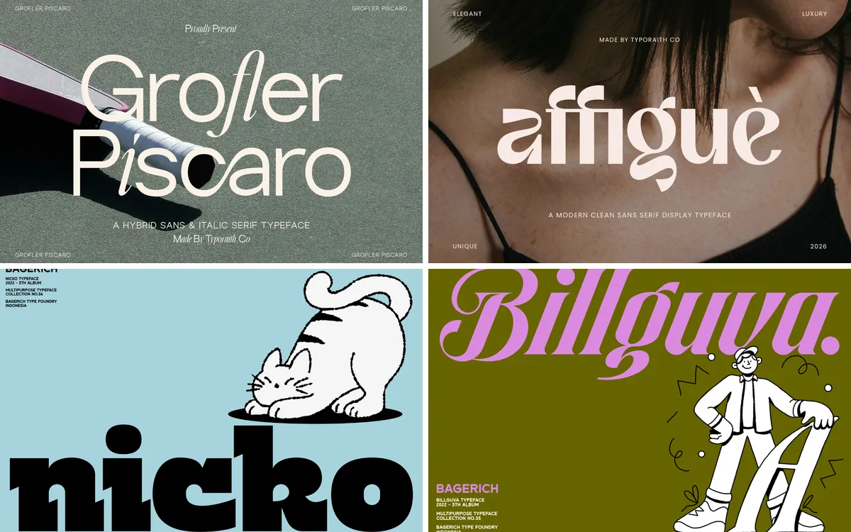
Magazine typography is a game of contrast: a dramatic headline face, a calm text face and plenty of white space. These are all headline faces, meant for covers, section openers, lookbook titles and posters.
We split them into two groups: high-contrast fashion serifs for the classic cover look, and condensed fonts for big, punchy cover lines.
The short version
- Elanche Font: classic fashion magazine covers
- Chelion Font: mastheads and posters
- Civons Font: article titles inside the magazine
- Oufale Font: pull quotes and beauty features
- Hightone Font: big cover lines
- Romusans Font: sports, music and streetwear editorials
- Chuner Font: high-impact headlines
In this guide
High-contrast fashion serifs
1. Elanche Font
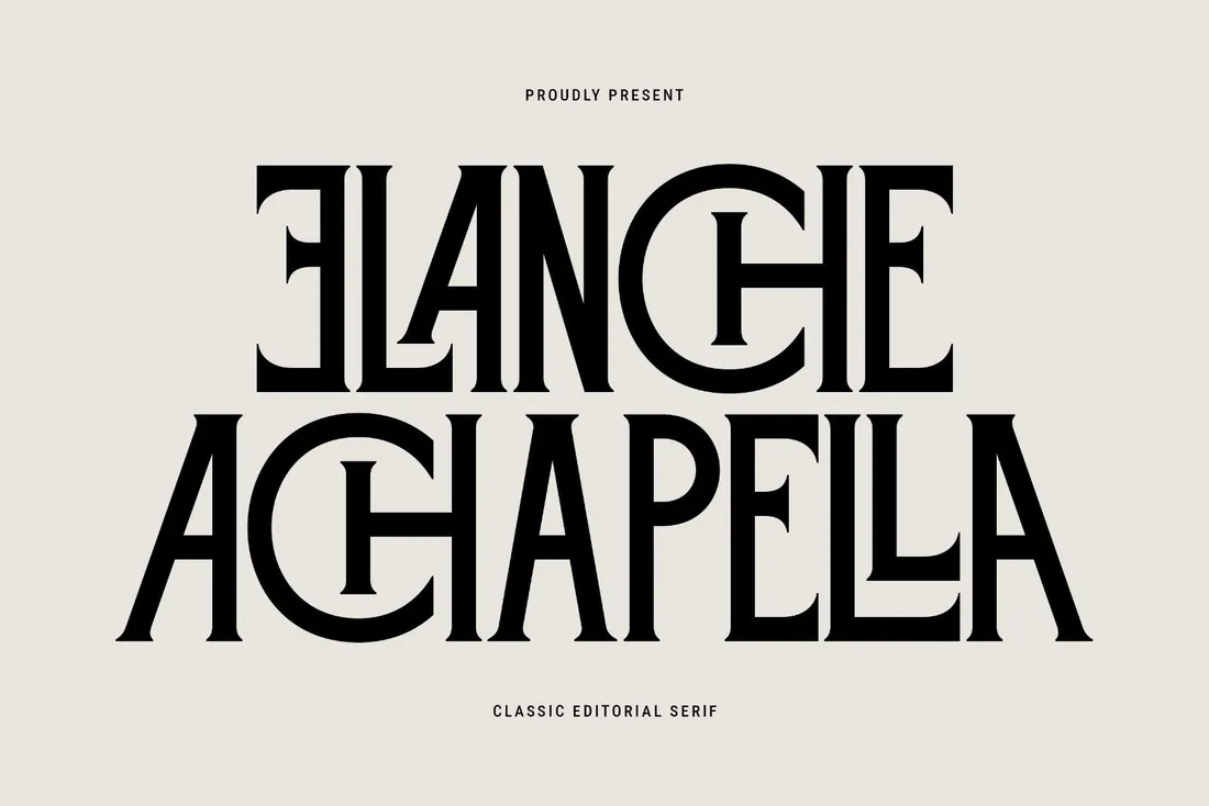
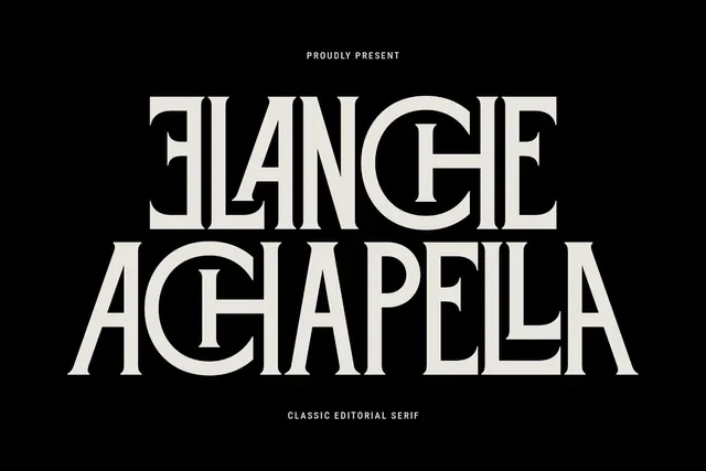
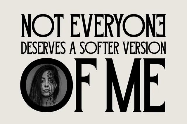
Set a magazine or blog name in Elanche and it reads as a fashion title straight away, thanks to ligatures that join letters in unexpected ways. The same trick works on book covers and lookbooks, where the title is the main design element.
- Best for: classic fashion magazine covers.
- Pair it with: Hightone for cover lines underneath the masthead.
- Tip: Use the decorative ligatures in titles and switch them off in subheads.
Where to download


2. Chelion Font
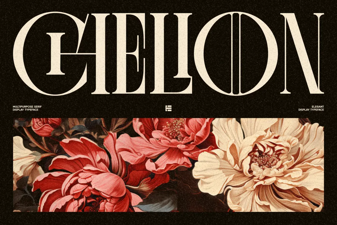
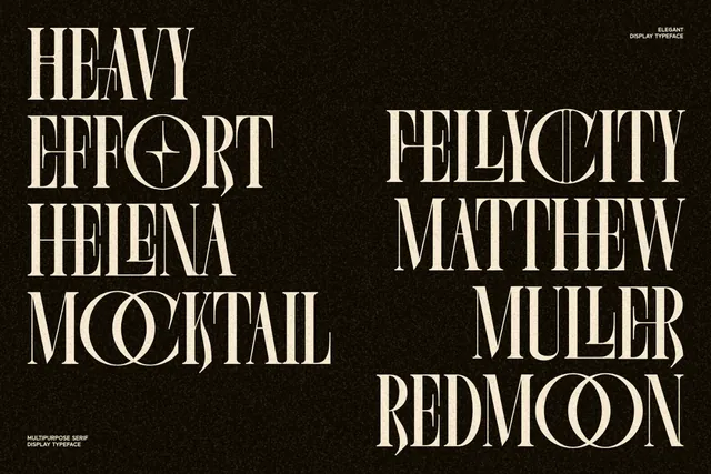
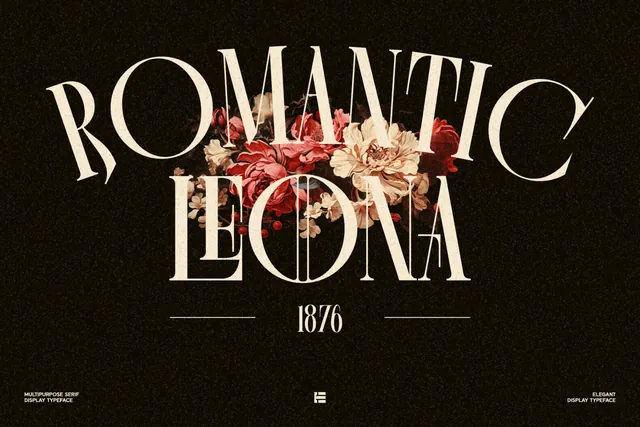
Chelion is a condensed, elegant display face with decorative alternates. It has the drama of vintage theater posters while staying clean enough for a modern cover. A one-word masthead in Chelion carries a cover on its own.
- Best for: mastheads and posters.
- Pair it with: A simple sans for cover lines so the masthead stays the star.
- Tip: Try the alternates on the first and last letter only.
Where to download
3. Civons Font
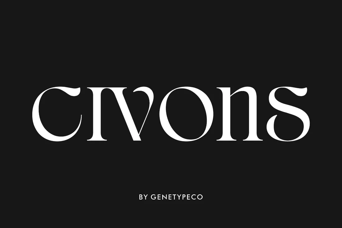
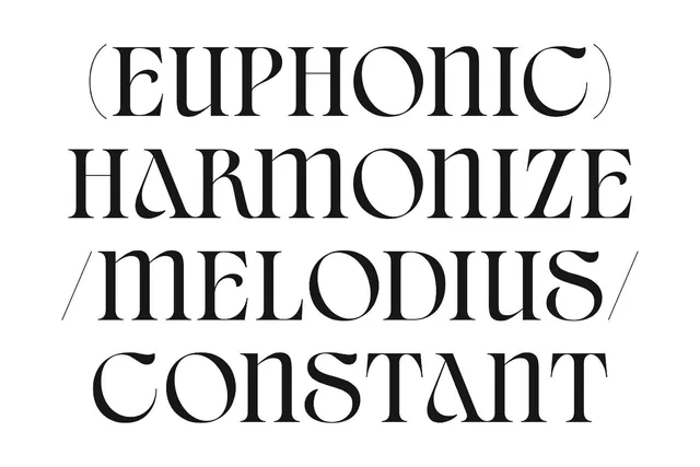
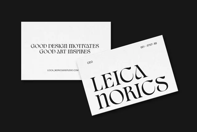
Civons is a serif display with classic proportions and a few contemporary details. It's less theatrical than the others, which makes it the workhorse of the group: article titles, pull-outs and brand editorials where the cover font would be too much.
- Best for: article titles inside the magazine.
- Pair it with: Elanche on the cover, Civons for titles inside.
- Tip: Set titles in sentence case; Civons looks more modern that way.
Where to download
4. Oufale Font
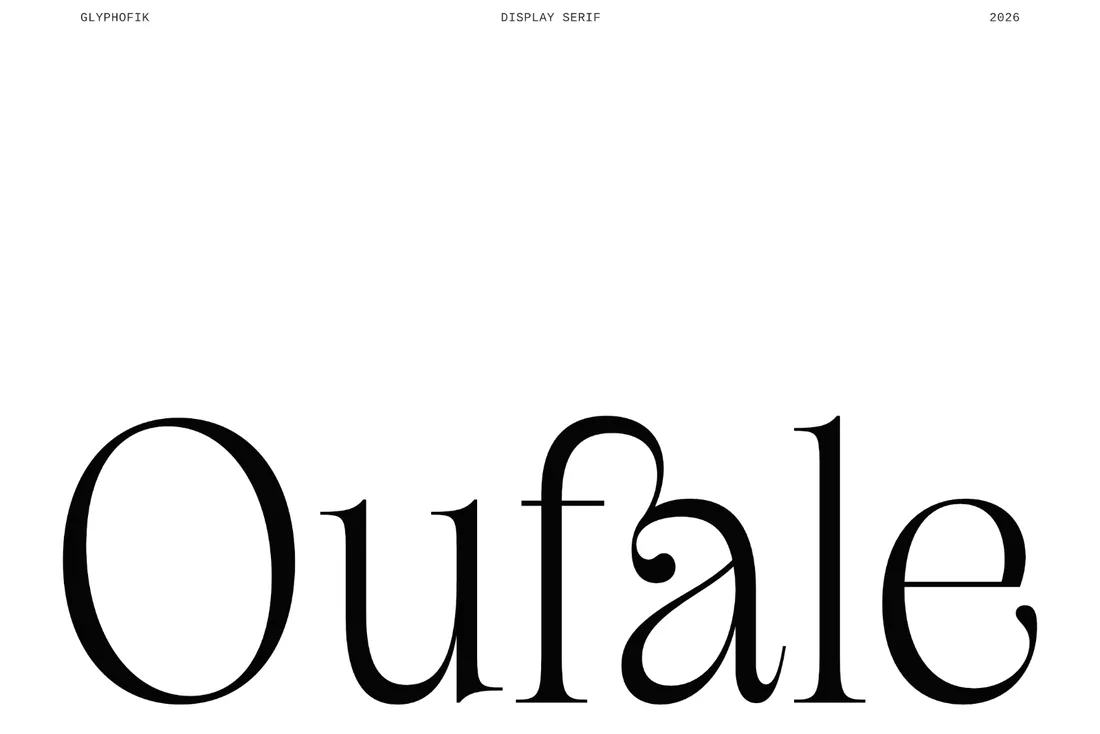
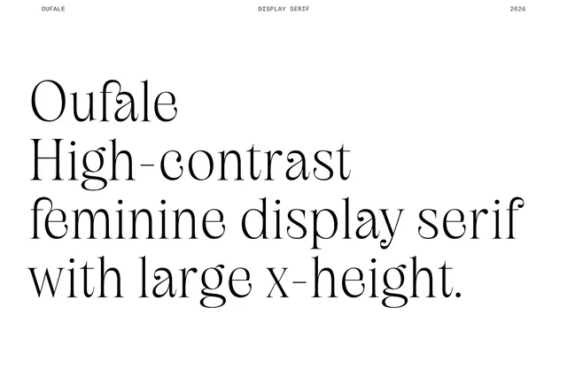
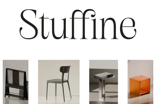
A pull quote set in a thin, high-contrast serif slows the reader down, which is exactly what beauty features, wedding editorials and quote pins need. The large x-height keeps even this light style readable on a phone screen.
- Best for: pull quotes and beauty features.
- Pair it with: Romusans for a bold contrast in sports or streetwear layouts.
- Tip: Thin strokes need size: give quotes at least 36px on screen.
Where to download
Condensed fonts for cover lines
5. Hightone Font
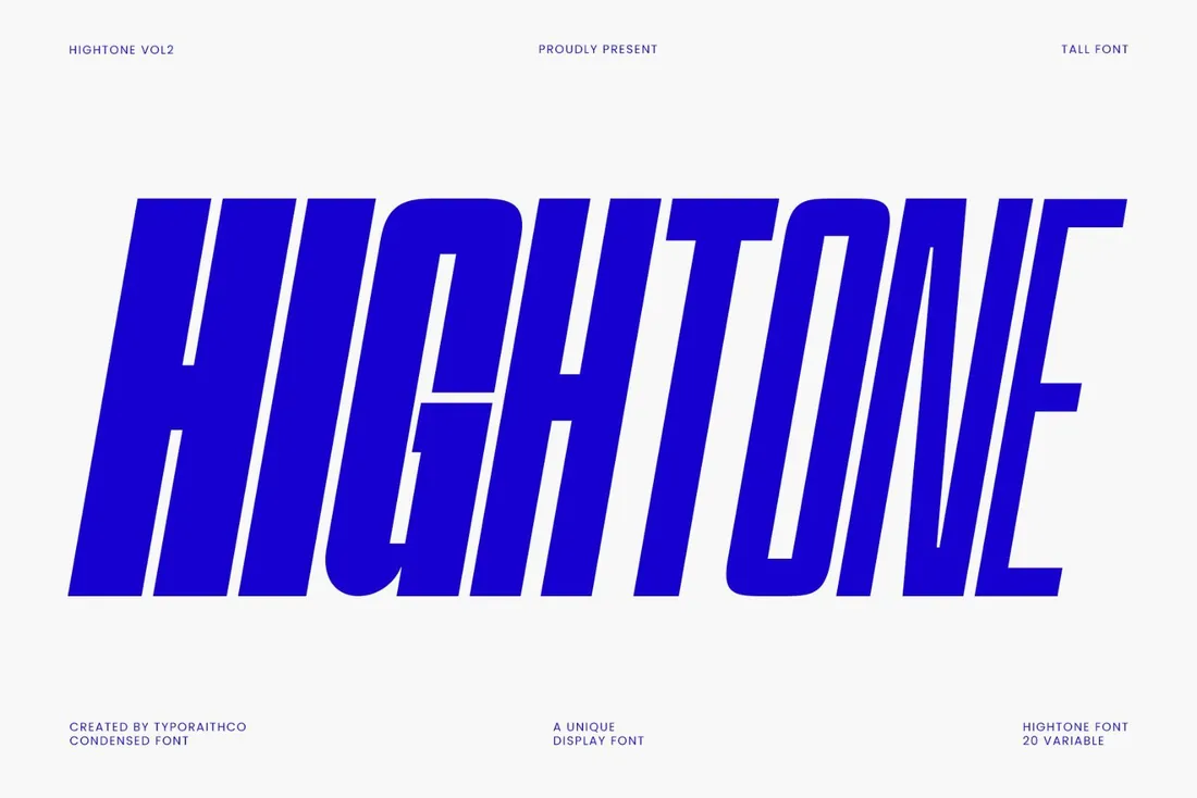
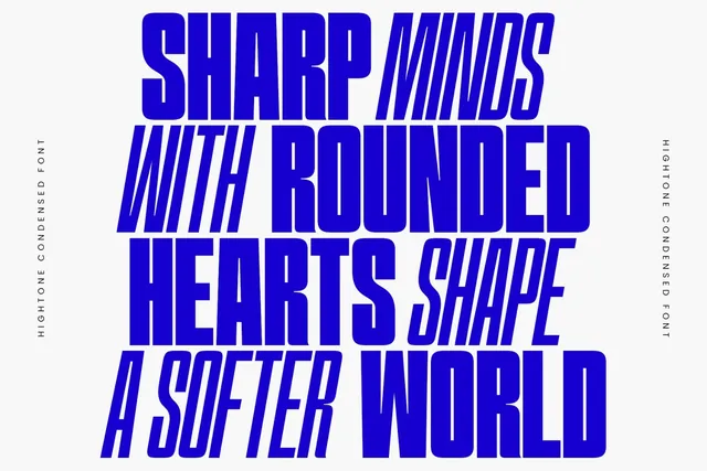
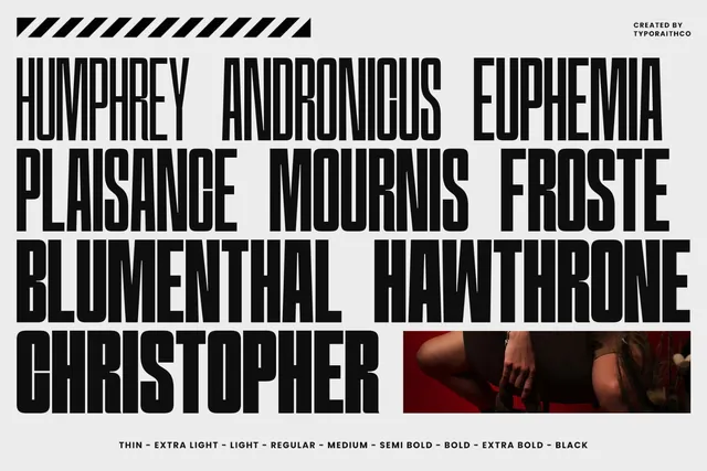
Hightone is a tall, narrow family with 20 variable styles from Thin to Black. You can set a whole cover line in one size and tune the weight to the photo underneath, which is exactly how professional covers balance text and image.
- Best for: big cover lines.
- Pair it with: Elanche or Civons for mastheads and article titles.
- Tip: Use a lighter weight over busy photos and a heavier one over clean backgrounds.
Where to download
6. Romusans Font
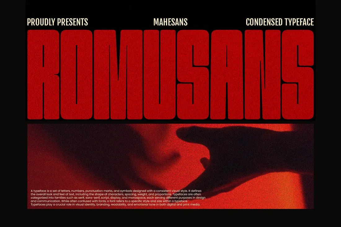
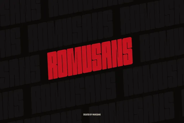
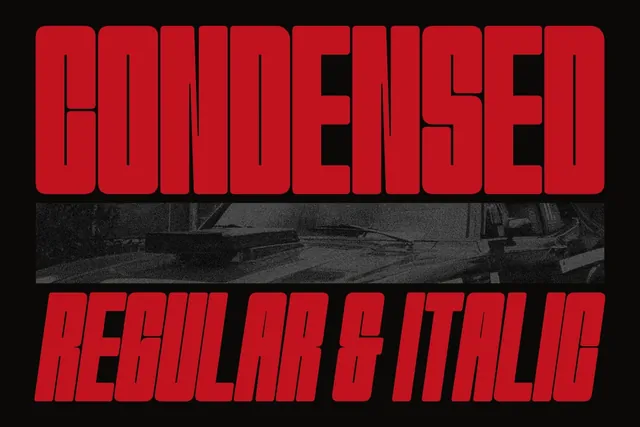
Romusans is an ultra-condensed caps font with soft rounded corners, in upright and italic. The italic adds motion, which is why it suits sports and streetwear spreads, album covers and posters.
- Best for: sports, music and streetwear editorials.
- Pair it with: Oufale for quotes, to balance the weight.
- Tip: It's caps only, so plan headlines without lowercase.
Where to download
7. Chuner Font
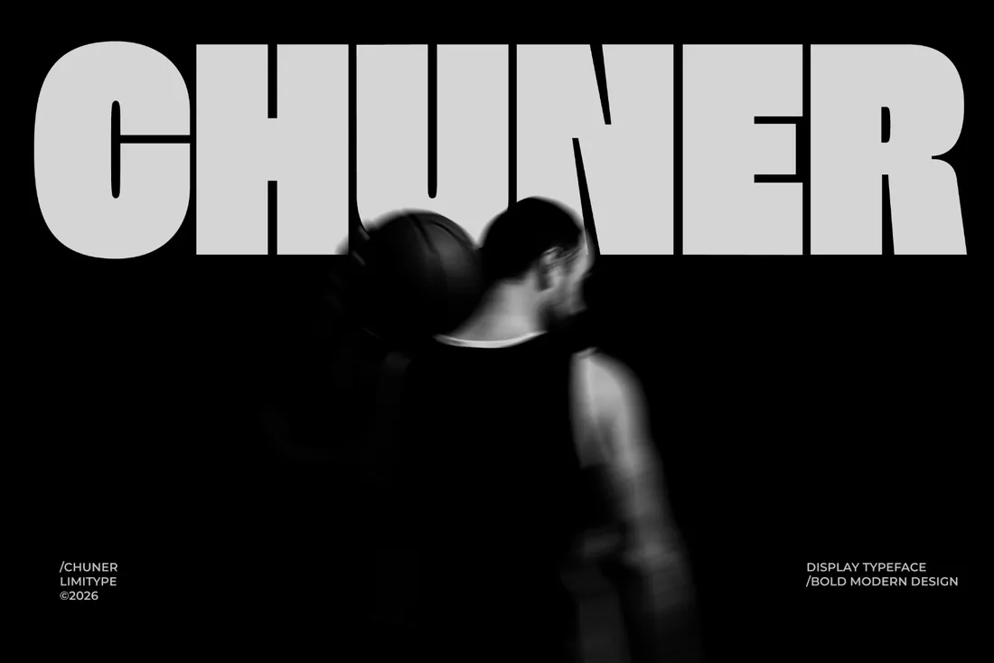
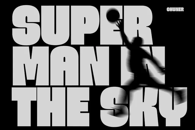
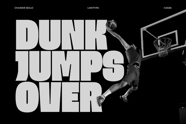
Chuner is a heavy, sporty sans that fills a page edge to edge. Place it behind a cut-out photo and you get the layered cover effect in one move. It's also strong for campaign banners and social headers.
- Best for: high-impact headlines.
- Pair it with: A light serif for a fashion-meets-sport contrast.
- Tip: Let the model's head overlap the letters; the word stays readable and the cover gains depth.
Where to download
A simple recipe for a magazine cover
- One masthead font: a high-contrast serif like Elanche or Chelion.
- One cover-line font: a condensed face like Hightone or Romusans.
- One neutral text font for small print, barcodes and dates.
By the numbers
- 1784is when the Didot family in Paris began cutting the high-contrast typefaces that still shape fashion mastheadsWikipedia: Didot (typeface)
- 1955is the year Didot became Vogue's permanent cover typeface, after appearing on its covers since the 1940sWikipedia: Didot (typeface)
Frequently asked questions
What font does a fashion magazine cover usually use?
High-contrast didone-style serifs for the masthead, often paired with condensed sans serifs for cover lines.
What is a condensed font?
A font with narrow letters, so more text fits in the same width. It's ideal for cover lines and posters.
Can I use these fonts for book covers?
Yes. Elanche, Civons and Chelion all work well on book covers; check the license if you're publishing commercially.
How many fonts should a magazine layout use?
Two or three: a headline face, a text face and occasionally an accent font.
What are the best editorial fonts?
Editorial fonts come in two main kinds: high-contrast serifs for mastheads and titles, like Elanche and Chelion, and condensed or sporty sans fonts for cover lines, like Hightone and Chuner. Civons works as a calmer serif for article titles.
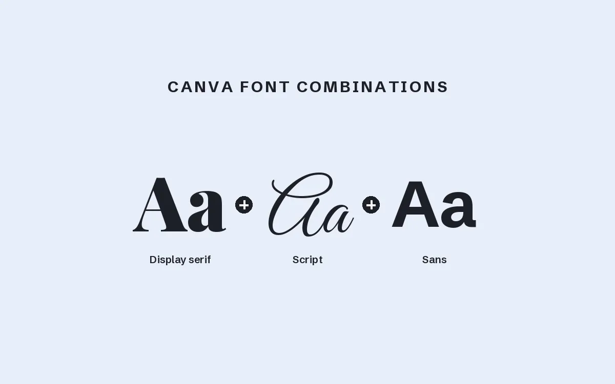
Can I use magazine fonts in Canva?
Yes. Upload the OTF or TTF file on a paid Canva plan and the font appears in your text menu, which is all you need to build a cover or a pin in the style of a fashion magazine.
Final thoughts
Pick one serif and one condensed font from this list, build a single cover and one inside spread, and you'll know within an hour whether the pair works.
Sources
Last checked October 31, 2026.
This guide contains affiliate links. If you buy through them, mockupex may earn a commission at no extra cost to you. Learn more