Vintage can mean anything from 1920s European posters to a groovy 70s font. Picking a retro font from the right decade is what makes a design feel intentional.
The fonts below are grouped by the look they bring: bold signage and 70s letters, editorial serifs with an old-world feel, and a handwritten retro script.
The short version
- Ricarlo Font: mid-century signage and coffee shops
- Bonnie Font: friendly vintage brands
- Norva Font: 70s soft-serve and kids' brands
- Perfect Mangue Font: 70s magazine and fashion
- French Macchiola Font: old European editorial
- Distressed Sherlock Font: a letterpress look
- Fairmont Font: handwritten vintage script
In this guide
Bold retro display fonts
1. Ricarlo Font
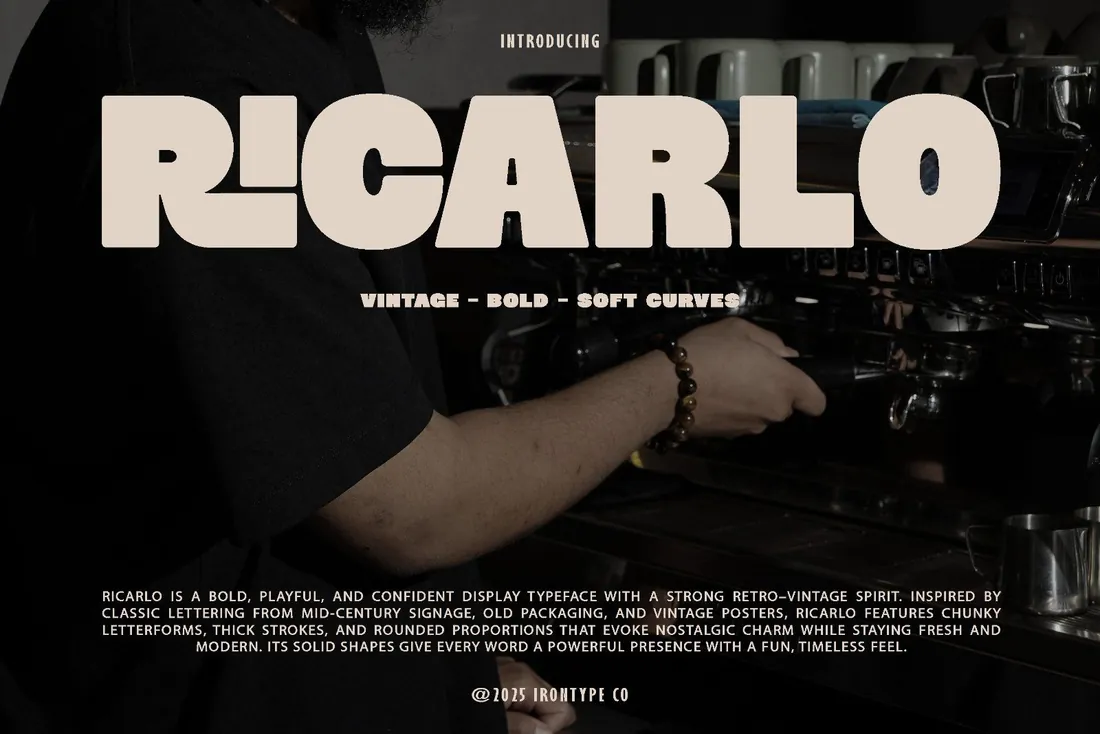
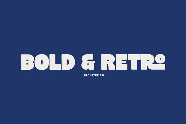
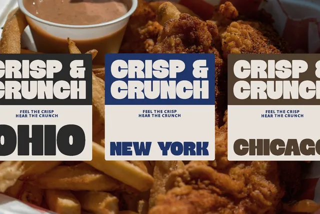
Coffee shops and bakeries want the warmth of a hand-painted sign, but they need a logo that prints cleanly on cups and stickers. Ricarlo gives both: mid-century shop-sign shapes, cleaned up, with alternates and ligatures that make a name look custom.
- Best for: mid-century signage and coffee shops.
- Pair it with: Fairmont for a handwritten tagline.
- Tip: Heavy and wide: short words and brand names work best.
Where to download

2. Bonnie Font
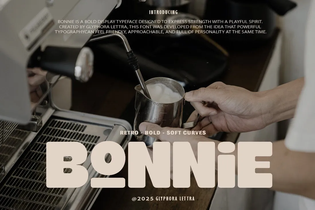
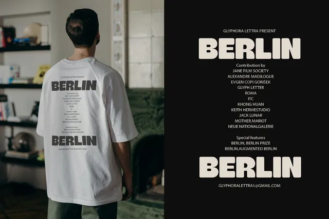
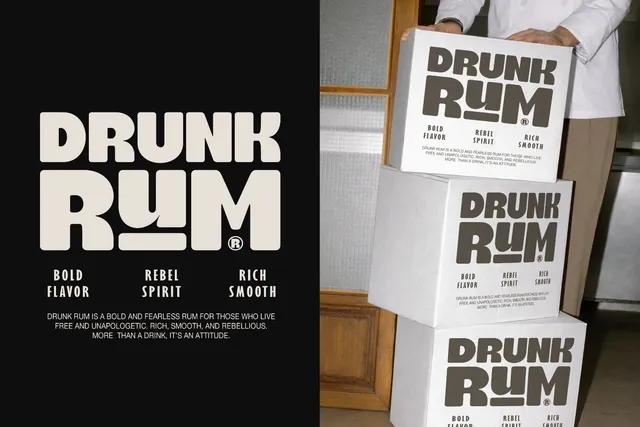
Food trucks and snack brands need a font that reads from across the street and still feels homemade. Bonnie is bold enough for the side of a truck and soft enough for a cookie bag, and its alternates make a short name look custom.
- Best for: friendly vintage brands.
- Pair it with: A simple sans for menus and labels.
- Tip: Choose Bonnie or Ricarlo for a project, not both; they compete.
Where to download
3. Norva Font
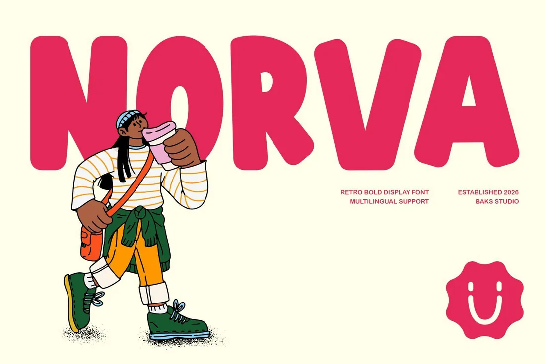
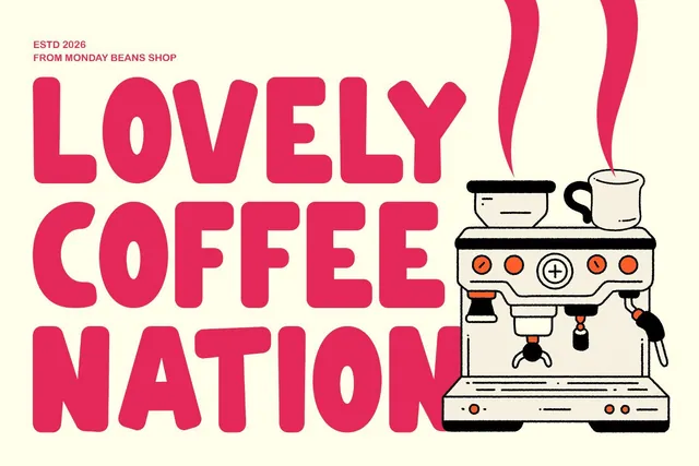
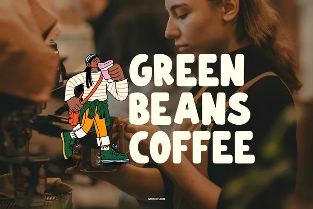
Bubble letters say '70s ice-cream shop' faster than any illustration, which makes Norva an easy win for desserts, kids' brands and merch drops. Even one word on a sticker or a tote bag is enough to set the mood.
- Best for: 70s soft-serve and kids' brands.
- Pair it with: Perfect Mangue for a more grown-up headline.
- Tip: Try it in two colors with a slight offset for an instant screen-print look.
Where to download

Retro serifs with an editorial feel
4. Perfect Mangue Font
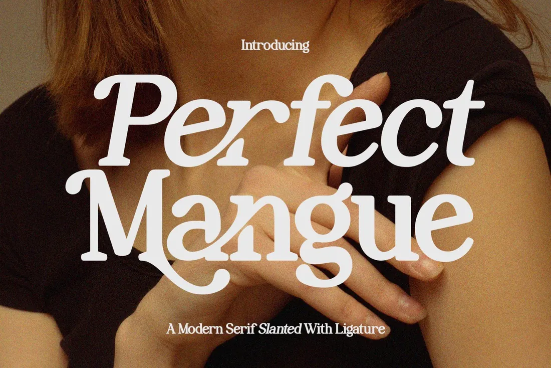
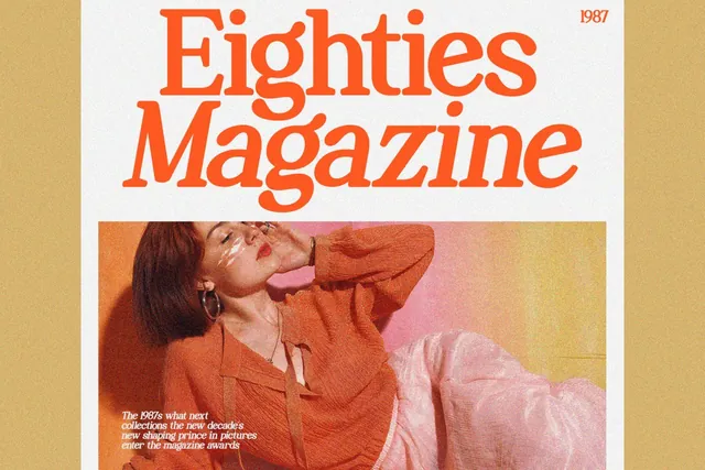
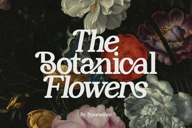
Perfect Mangue is a bold, slanted serif with soft curves and ligatures, in Regular and Slanted. It has the confident italic of 70s fashion magazines and works for fashion logos, magazine titles and invitations alike.
- Best for: 70s magazine and fashion.
- Pair it with: Norva for a playful accent, or a clean sans for body text.
- Tip: The slanted style is the hero; keep the regular cut for supporting lines.
Where to download
5. French Macchiola Font
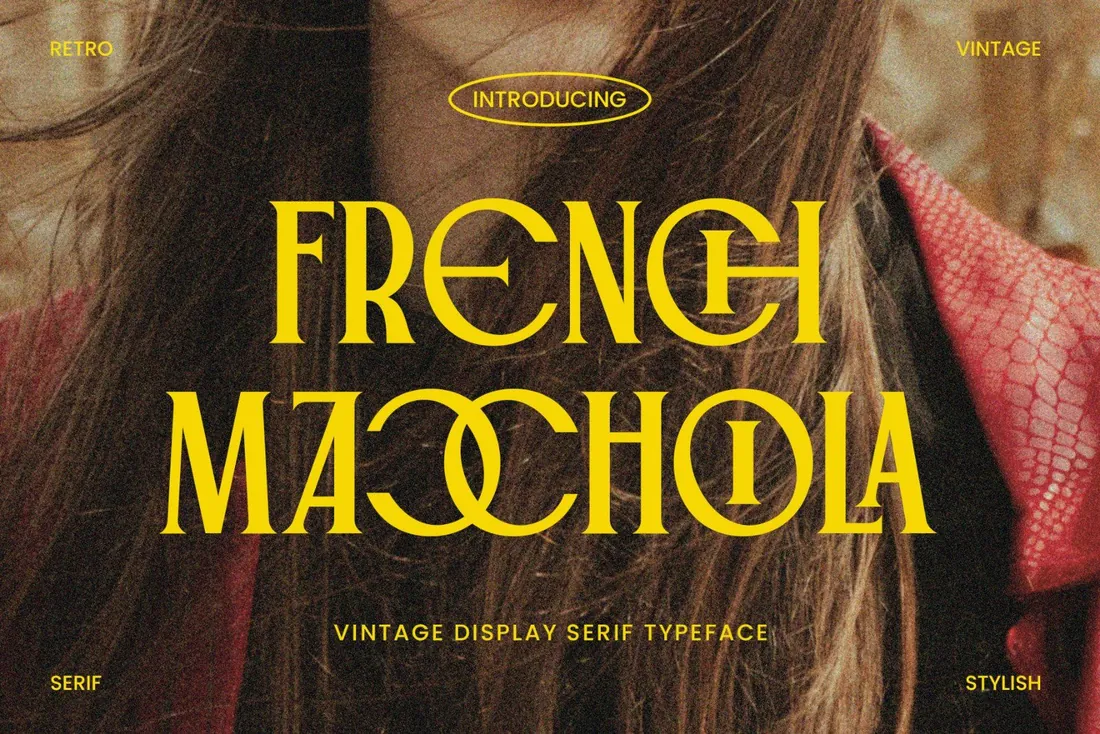
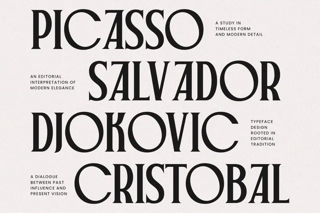
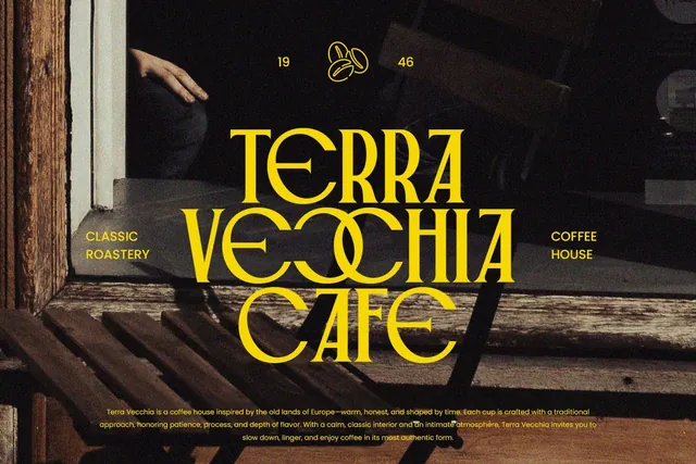
Wine, cheese and bakery labels often borrow from old French magazine covers and theater bills. French Macchiola brings that look ready-made, ligatures included, for labels, menus, posters and editorial headlines.
- Best for: old European editorial.
- Pair it with: Distressed Sherlock for texture in the same layout.
- Tip: Ligatures can slow reading at small sizes; keep them for headlines.
Where to download
6. Distressed Sherlock Font
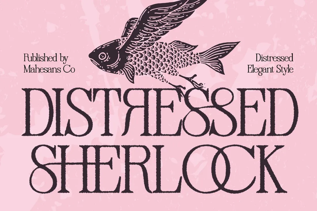
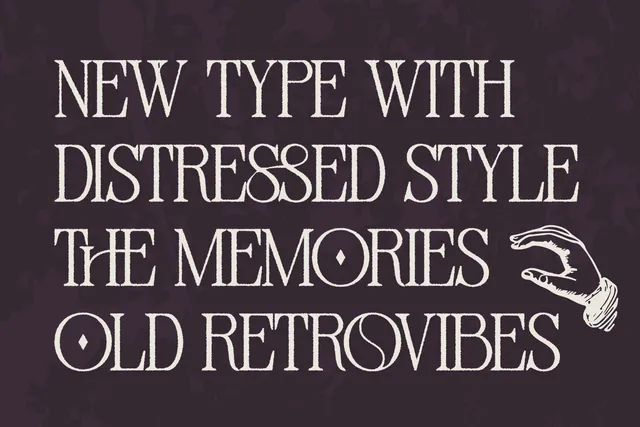
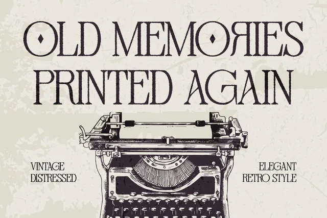
Distressed Sherlock is an elegant serif with a built-in distressed texture, so text looks letterpressed without any extra effects. Alternates and ligatures make it feel custom, which suits book covers, labels and posters.
- Best for: a letterpress look.
- Pair it with: A clean serif for small text where texture would get in the way.
- Tip: The texture is part of the letters, so keep a clean font alongside for crisp details.
Where to download

Retro script
7. Fairmont Font
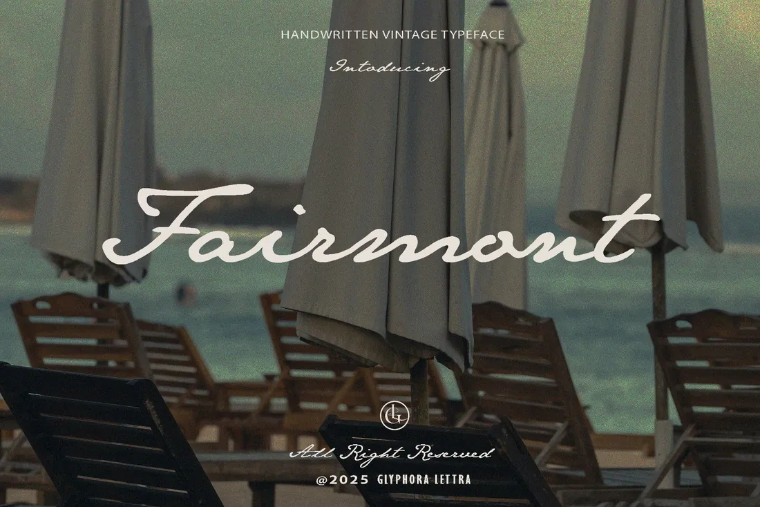
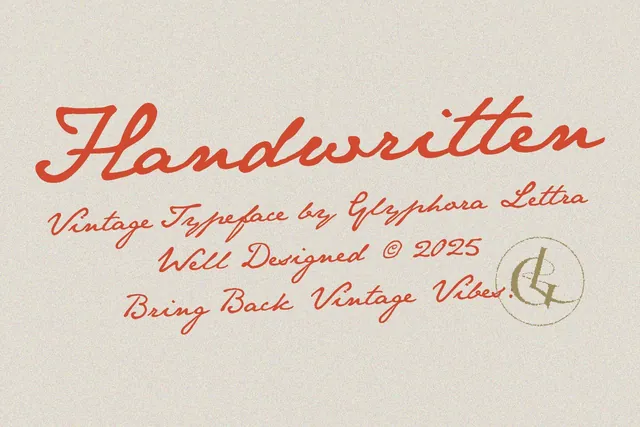
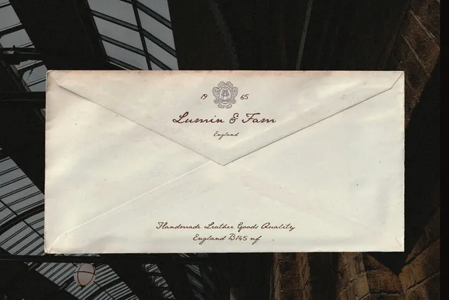
Fairmont is a flowing handwritten script with seaside, old-postcard charm, and the best-seller of this list. It pairs easily with any of the bold faces above and adds warmth to signatures, quotes and travel or wedding designs.
- Best for: handwritten vintage script.
- Pair it with: Ricarlo or Bonnie for the main headline.
- Tip: Scripts in all caps are hard to read; use title case or lowercase.
Where to download
Making a retro design look authentic
- Choose one decade and stick to it: a 70s font with a 1920s ornament looks confused.
- Use slightly muted colors rather than pure black and white.
- Add texture with paper or print mockups instead of heavy filters.
By the numbers
- 1922is the year Cooper Black, the soft heavy serif that retro lettering still borrows from, was released by the Barnhart Brothers & Spindler foundryWikipedia: Cooper Black
- 1966is the year Cooper Black went on the cover of the Beach Boys' Pet Sounds, one of many album covers set in itWikipedia: Cooper Black
Frequently asked questions
What is the difference between vintage and retro fonts?
People use the terms interchangeably. Vintage usually means designs inspired by older originals; retro often means a modern take on a past decade, like 70s groovy letters.
What font looks like the 70s?
Bubbly, rounded display fonts like Norva, or slanted serifs like Perfect Mangue.
Are these fonts good for T-shirts?
Yes. Bold retro fonts like Ricarlo and Bonnie are popular for merch. Check that your license covers products for sale.
What is a good retro script font?
Fairmont is a flowing handwritten script with a vintage feel that pairs well with bold retro display fonts.
Which vintage and retro fonts work in Canva?
Any OTF or TTF file can be uploaded to Canva on its paid plans, so every vintage font in this guide works there. Ricarlo and Norva are especially easy wins for retro social posts and menus.
Final thoughts
Decide on the era first, then pick one bold display font and, if you need it, one script. Two fonts from the same decade will always look more authentic than five from different ones.
Sources
Last checked October 31, 2026.
This guide contains affiliate links. If you buy through them, mockupex may earn a commission at no extra cost to you. Learn more